8.1 Hazard data
The first key input for hazard risk analysis is data that describes the hazard through spatiotemporal “intensity measures”. If we focus on hazards that are discrete events, then we would expect that for a given event, whether it happened in the past or is predicted to happen in the future, we could geospatially visualize the boundary of that hazard, and for every point within that boundary, we could assign a non-zero value that describes whatever kind of physics is of particular concern to us. Depending on the hazard, there may be multiple kinds of intensity measures; for example, in a hurricane, we might be able to describe wind speeds at every point in space, as well as floor depth, as well as flood duration. Depending on data availability, we may have detailed empirical measurements, or best approximations through models, or just barely enough of a ballpark guess to do any meaningful risk analysis at all. But the focus of the “hazard” step of SURF is to identify one or more intensity measures of concern and collect as many representations of hazard events as possible. And for predicted events in the future, we will also need to be able to attach probabilities of occurrence to events of different intensities.
Our first example of hazard data collection is wildfires. CalFire’s site appears to have a comprehensive record of wildfire incidents, including date, some loss information, and, at least for active fires of interest, geometries of the burn perimeter. There are download links at the bottom of the site, but they don’t appear to contain boundary information, just latitude and longitude. If we wanted to read the perimeters, say to investigate communities and physical assets within the exposure zone (which you should be able to carry out using the techniques in this curriculum so far), we need to dig deeper to access this information. Note the Esri branding on the map; this is a promising signal that, with the right searching, we can find a backend ArcGIS service that enables reading of the underlying geometry data. The link does not show up anywhere on this page, but if, on your browser, you navigate to “Developer Tools” (different ways depending on your browser), and Ctrl+F search for the phrase “arcgis/rest/services”, you should be able to spot a URL that looks like “https://services3.arcgis.com/T4QMspbfLg3qTGWY/ArcGIS/rest/services/Public_Wildfire_Perimeters_View/FeatureServer/0/query?outFields=*&where=1%3Da”. The snippet “Public_Wildfire_Perimeters” is the clue that this is likely useful for us. Navigating to this URL (with everything up to the “/0”) gets you to a common kind of file storage system called ArcGIS REST Services. Many governments use ArcGIS to power their mapping activities, and often ArcGIS maps and dashboards are built off of data that is hosted in this type of directory, which average web users will never be directed to, but where data analysts can extract raw data (assuming the organization has provided public access). The “Supported Operations” at the bottom are like APIs that you can use to pull data, but here we’ll take advantage of a package called esri2sf to grab sf objects out of any ArcGIS Feature Server that contains polygons.
library(remotes)
install_github("yonghah/esri2sf")

library(tidyverse)
library(sf)
library(leaflet)
library(mapboxapi)
library(tigris)
library(jsonlite)
library(esri2sf)
library(raster)
ca_fires <- esri2sf("https://services3.arcgis.com/T4QMspbfLg3qTGWY/ArcGIS/rest/services/Public_Wildfire_Perimeters_View/FeatureServer/0")Make sure to provide the URL up to the “/0”. Let’s filter to the Bay Area and plot:
bay_county_names <-
  c(
    "Alameda",
    "Contra Costa",
    "Marin",
    "Napa",
    "San Francisco",
    "San Mateo",
    "Santa Clara",
    "Solano",
    "Sonoma"
  )

bay_counties <-
  counties("CA", cb = T, progress_bar = F) %>%
  filter(NAME %in% bay_county_names) %>%
  st_transform(4326)

bay_fires <-
ca_fires[bay_counties, ]leaflet() %>%
addMapboxTiles(
style_id = "satellite-streets-v11",
username = "mapbox"
) %>%
addPolygons(
data = bay_fires,
color = "red"
)I’ll leave you to explore this dataset on your own. Wildfire hazard data is unique in the sense that the “intensity measure” is essentially absolute, in/out of the boundary. It also is difficult to model predictively, leaving us with broad “fire threat zones” from similar public sources, and the concept of a “wildland urban interface” (WUI) as a proxy for risky areas.
Wildfires also cause significant downstream hazards in the form of air pollution, which we’ve covered how to analyze in Section 7.3.
Let’s now turn to Cal-Adapt, a comprehensive source of hazard forecasts which also has a robust API. Under their “Climate Indicator” offerings, we can access data on cooling and heating degree days, which we briefly mentioned in Section 7.2, extreme heat days, and extreme precipitation days. Let’s demonstrate how to structure inputs for the API for extreme heat days. The link provides the following example request: “/api/series/tasmax_day_HadGEM2-ES_rcp85/exheat/?g=POINT(-121.46+38.59)”. This is akin to typing “https://api.cal-adapt.org/api/series/tasmax_day_HadGEM2-ES_rcp85/exheat/?g=POINT(-121.46+38.59)” into your browser, which will provide you a raw JSON. The following features of this string are relevant to us:
tasmax_dayprovides us with extreme heat days, specifically.HadGEM2_ESis one of four models used by California’s Climate Action Team for projecting future climate. This one is a “warm/dry simulation”, whileCanESM2is an “average simulation”.- After
?g=is geometry information in WKT form, with spaces replaced by+. We can convert our CBG shape into a string formatted this way. I found that there is a limit to the size of this string, though, which is breached around 100 points per geometry, so we’ll need to simplify certain polygons usingst_simplify()when we process many CBGs. - This format also means that any CBGs that might be MULTIPOLYGONs (two separate shapes) will need to be split into two portions.
- According to the API documentation, we can also add
&stat=meanto our API call to average out the results if our polygon crosses multiple “cells” for which they report data (cells being about 3.7 miles wide).
Let’s pick a test CBG and develop the code necessary to pull data from the API:
smc_cbgs <-
  block_groups("CA","San Mateo County", cb = T, progress_bar = F) %>%
  st_cast("MULTIPOLYGON") %>%
  st_cast("POLYGON")

projection <- "+proj=utm +zone=10 +ellps=GRS80 +datum=NAD83 +units=ft +no_defs"

test_cbg <-
  smc_cbgs %>%
  filter(GEOID == "060816076003") %>%
  pull(geometry) %>%
  st_transform(projection) %>%
  st_simplify(
    dTolerance = ifelse(
      npts(smc_cbgs[row, ]$geometry) > 100,
      400,
      0
    )
  ) %>%
  st_transform(4326) %>%
  st_as_text() %>%
  str_replace_all(" ","+")

test_exheat <-
  fromJSON(
    paste0(
      "https://api.cal-adapt.org/api/series/tasmax_day_CanESM2_rcp85/exheat/?g=",
      test_cbg,
      "&stat=mean"
    )
  ) %>%
  .$counts %>%
  unlist() %>%
  as.data.frame() %>%
  rownames_to_column() %>%
  rename(
    year = rowname,
    exheat = "."
  ) %>%
  mutate(
    year = substr(year,1,10) %>% as.Date()
  )
Notes:
st_simplify()requires the geometry be in a projected coordinate system.npts()gets the number of vertices in a geometry object.dToleranceis a tolerance parameter, in feet. The effect will be to cut some corners in the original shape to reduce the number of points. The number400is arbitrary here; I played with this number in running all SMC CBGs later, and it was the lowest number in the hundreds necessary to successfully run all CBGs. You can expect to sometimes need to manually adjust a parameter like this to help your analysis run most efficiently.st_as_text()converts the geometry column into a WKT string.str_replace_all()then removes and replaces parts of the string, in our case spaces with “+”s as needed in the API call.- The output of
fromJSONis a list, where the information we’re interested in is within a sublist named “counts”.
Let’s see what this raw data looks like for one CBG:
test_exheat %>%
  ggplot(
    aes(
      x = year,
      y = exheat
    )
  ) +
  geom_line() +
  labs(
    x = "Year",
    y = "Extreme heat days",
    title = "CBG: 060816076003"
  )
Now, let’s package this into a for loop to run through all CBGs in SMC.
exheat_full <- NULL

for(row in 1:nrow(smc_cbgs)) {

  print(row)

  temp <-
    fromJSON(
      paste0(
        "https://api.cal-adapt.org/api/series/tasmax_day_CanESM2_rcp85/exheat/?g=",
        smc_cbgs[row, ]$geometry %>%
          st_transform(projection) %>%
          st_simplify(
            dTolerance = ifelse(
              npts(smc_cbgs[row, ]$geometry) > 100,
              400,
              0
            )
          ) %>%
          st_transform(4326) %>%
          st_as_text() %>%
          str_replace_all(" ","+"),
        "&stat=mean"
      )
    ) %>%
    .$counts %>%
    unlist() %>%
    as.data.frame() %>%
    rownames_to_column() %>%
    rename(
      year = rowname,
      exheat = "."
    ) %>%
    mutate(
      year = substr(year,1,10) %>% as.Date(),
      cbg = smc_cbgs[row,]$GEOID
    )

  exheat_full <-
    exheat_full %>%
    rbind(temp)

  if(row%%10 == 0) {
    print(row)
    saveRDS(exheat_full, "exheat_full.rds")
  }

}

saveRDS(exheat_full, "exheat_full.rds")
The following ggplot() demonstrates the use of geom_ribbon to create a +/-1 standard deviation band:
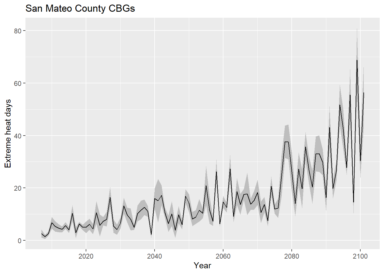
exheat_full %>%
  group_by(year) %>%
  summarize(
    exheat_mean = mean(exheat, na.rm = T),
    exheat_sd = sd(exheat, na.rm = T)
  ) %>%
  ggplot(
    aes(
      x = year
    )
  ) +
  geom_ribbon(
    aes(
      ymin = exheat_mean - exheat_sd,
      ymax = exheat_mean + exheat_sd
    ),
    fill = "grey"
  ) +
  geom_line(
    aes(
      y = exheat_mean
    )
  ) +
  labs(
    x = "Year",
    y = "Extreme heat days",
    title = "San Mateo County CBGs"
  )
And let’s also map the mean extreme heat days per year, in the 2020s:
exheat_2020s <-
  exheat_full %>%
  filter(year >= "2020-01-01" & year <= "2029-12-31") %>%
  group_by(cbg) %>%
  summarize(exheat = mean(exheat, na.rm = T)) %>%
  left_join(smc_cbgs %>% dplyr::select(cbg = GEOID)) %>%
  st_as_sf()

heat_pal <- colorNumeric(
  palette = "Reds",
  domain = exheat_2020s$exheat
)

leaflet() %>%
  addMapboxTiles(
    style_id = "streets-v11",
    username = "mapbox"
  ) %>%
  addPolygons(
    data = exheat_2020s,
    fillColor = ~heat_pal(exheat),
    fillOpacity = 0.5,
    color = "white",
    weight = 0.5,
    label = ~paste0(cbg, ": ", exheat, " extreme heat days per year over the next decade"),
    highlightOptions = highlightOptions(
      weight = 2,
      opacity = 1
    )
  ) %>%
  addLegend(
    data = exheat_2020s,
    pal = heat_pal,
    values = ~exheat,
    title = "Extreme heat days<br>per year over<br>next decade"
  )
The format of this hazard data’s “intensity measure”, as we’ve gathered it, is a predicted number of “bad events” per year, into the future, but in this format we don’t have the temperature value itself; the API allows for a temperature threshold to be set, which would allow us to back out the exact temperatures of the predicted “bad events”. However, overall, this information provides a useful input to simulate the overall quantity of events that could themselves produce downstream risks of health and other issues.
As a last demonstration, we’ll turn to hazard data that comes in the form of discrete events with “return periods”, meaning that the modelers predict a certain percentage likelihood that, in a given year, there will be at least one event of at least that magnitude. For example, a 5-year return period means that each year there is a 1-in-5 or 20% chance of “exceedance” of the intensities shown in the given hazard map. There is still a lot of uncertainty built into such a definition, but if a model produces multiple simulations, each with their own return periods, then the maps can be strung together in sequence so that “exceedance rates” become “occurrence” rates. For example, if the most “intense” event modeled is a 1-in-5 event, then the information within that event (e.g. 2ft of flooding here, 3ft of flooding there) is the most intense magnitude we plug into our model, representing the 0-20% range of possibilities (the other 80% is lower magnitude events, or no hazard at all). But if there is a 1-in-5 event along with a 1-in-10 event, then the 1-in-10 event takes over some of that 0-20% range, because it’s a more intense event than the 1-in-5 event, which had been our only stand-in for “events of some magnitude or more”. So then we would assign the magnitudes in the 1-in-5 event an “occurrence rate” in the 10-20% range, or 10%, and the magnitudes in the 1-in-10 event get an “occurrence rate” (still “exceedance rate” if it’s the most intense event we have modeled) in the 0-10% range, or 10%. If we get yet another more intense event modeled, like a 1-in-100 year event, then it would chip away from the 0-10% range, and on and on.
The precipitation data from Cal-Adapt comes in this form, but let’s demonstrate using another data source, Our Coast Our Future, which provides significantly more granular hazard data in the form of coastal flood maps. On the user interface, you can select different combinations of sea level rise and storm surge, resulting in different flood maps with a resolution of 2x2 meters. The storm surge options, “Annual”, “20-year”, and “100-year”, are like the return period events we just discussed. They can be combined in the way described, given a specific base sea level. One level down, different sea level rise scenarios also have “return periods”, in the sense that there are climate models that predict that, say in 2030, there’s some “exceedance rate” for 25 cm of SLR, and on and on. Later in this chapter, we’ll cover where to find such SLR exceedance rates, and how to perform all the probabilistic math in R. But for the rest of this section, we’ll focus on how to load all the various hazard scenarios as “raster” information into R.
When you click on “Get Data” and then drag a rectangle, you get a pop-up with a zip file for download. Its link looks something like: “http://geo.pointblue.org/ocofmap/zip_v2.php?activelayer=Inner+Bay%20Flood%20Depth%20000cm%20SLR%20%2B%20Wave%20000&downloadarea=52682092.31987834&left=-122.17462943698&right=-122.09703849462&upper=37.509913928316&lower=37.440707500055”. Again, this looks like something we can formulate in R, looping through every hazard scenario we want:
Inner+Bay%20Floodfocuses on the Bay Area, so we’ll always want to keep that snippet as such.Depth%20000cm%20SLRis the sea level rise; if you ignore the “%20”s which represent spaces, it’s actually three digits in the middle (here “000”) which hold the key information. So we can generate our own three digits through a loop.Wave%20000, similarly, is holding the return period in the last three digits.downloadarea=does not appear to be necessary to include.left=,right=,upper=, andlower=appear to be lat/long bounding coordinates, which we can generate from anysfobject usingst_bbox(). The result is a named list of four numbers, which can be referenced by their names: “xmin”, “xmax”, “ymax”, and “ymin”.
Using East Palo Alto as an example, let’s create our own example URL with EPA’s bounding coordinates, and grabbing the hazard raster representing 0 cm of SLR (current conditions) and a 20-year return period storm.
epa_boundary <-
  places("CA", cb = T, progress_bar = F) %>%
  filter(NAME == "East Palo Alto") %>%
  st_transform(4326)

epa_bbox <- epa_boundary %>%
  st_bbox()
slr <- 0
rp <- 20
test_url <- paste0(
"http://geo.pointblue.org/ocofmap/zip_v2.php?activelayer=Inner+Bay%20Flood%20Depth%20",
str_pad(slr, 3, "left", "0"),
"cm%20SLR%20%2B%20Wave%20",
str_pad(rp, 3, "left", "0"),
"&left=",
epa_bbox["xmin"],
"&right=",
epa_bbox["xmax"],
"&upper=",
epa_bbox["ymax"],
"&lower=",
epa_bbox["ymin"]
)
temp <- tempfile()
download.file(test_url, destfile = temp, mode = "wb")
test_filename <- paste0(
"innerbay/SLR",
str_pad(slr, 3, "left", "0"),
"Wave",
str_pad(rp, 3, "left", "0"),
"_flddeep.tif"
)
test_flood <- raster(unzip(temp, test_filename))
unlink(temp)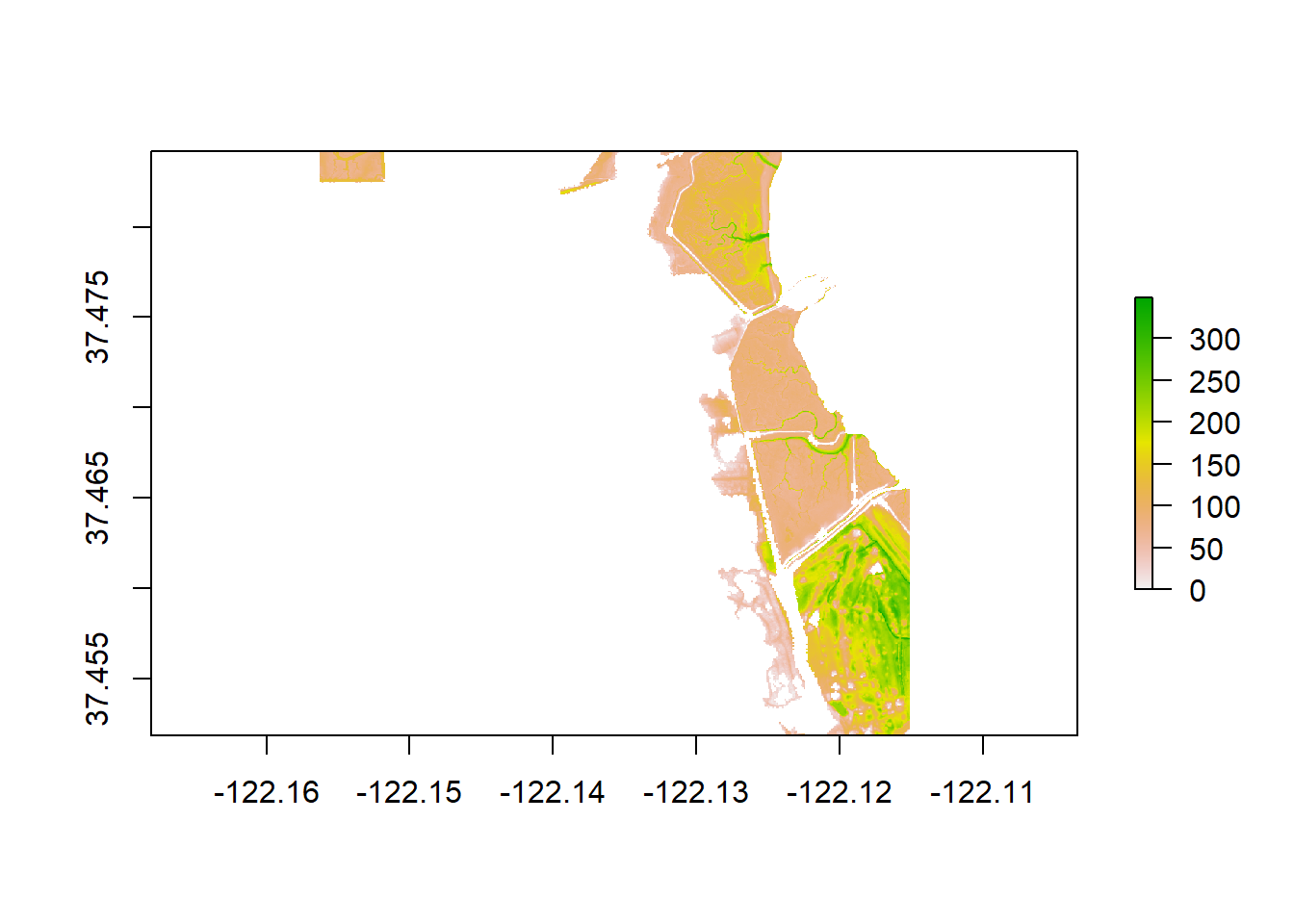
rasters is the foundational package for working with rasters, and rasters() is used to make a Raster object. Raster files can also be loaded in using read_stars() from the stars package; a stars object has certain advantages for certain raster operations (we used st_rasterize() in Section 7.3), but often needs to be converted back to a Raster object for other operations stars can’t do, including plotting in a leaflet map, as we do below with our object already in raster form, using addRasterImage() that adds onto a leaflet pipeline:
flood_pal <- colorNumeric(
  palette = "Blues",
  domain = values(test_flood),
  na.color = "transparent"
)

leaflet() %>%
  addMapboxTiles(
    style_id = "satellite-streets-v11",
    username = "mapbox"
  ) %>%
  addRasterImage(
    test_flood,
    colors = flood_pal
  ) %>%
  addLegend(
    pal = flood_pal,
    values = values(test_flood),
    title = "Flood depth, cm"
  )
Surprisingly, when trying another SLR and RP combination, we get a different-looking result:
slr <- 25
rp <- 20

test_url <- paste0(
  "http://geo.pointblue.org/ocofmap/zip_v2.php?activelayer=Inner+Bay%20Flood%20Depth%20",
  str_pad(slr, 3, "left", "0"),
  "cm%20SLR%20%2B%20Wave%20",
  str_pad(rp, 3, "left", "0"),
  "&left=",
  epa_bbox["xmin"],
  "&right=",
  epa_bbox["xmax"],
  "&upper=",
  epa_bbox["ymax"],
  "&lower=",
  epa_bbox["ymin"]
)

temp <- tempfile()

download.file(test_url, destfile = temp, mode = "wb")

test_filename <- paste0(
  "innerbay/SLR",
  str_pad(slr, 3, "left", "0"),
  "Wave",
  str_pad(rp, 3, "left", "0"),
  "_flddeep.tif"
)

test_flood <- raster(unzip(temp, test_filename))

unlink(temp)
flood_pal <- colorNumeric(
palette = "Blues",
domain = values(test_flood),
na.color = "transparent"
)
leaflet() %>%
addMapboxTiles(
style_id = "satellite-streets-v11",
username = "mapbox"
) %>%
addRasterImage(
test_flood,
colors = flood_pal
) %>%
addLegend(
pal = flood_pal,
values = values(test_flood),
title = "Flood depth, cm"
)It appears that the data source is not consistent on how it treats “unflooded” areas, sometimes logging them as 0s and sometimes as NAs. For the analysis we will perform intersecting hazard and exposure data, it’s actually good to have the unflooded areas logged as NAs at certain steps and 0s at others, but mapping certainly benefits from NAs, so for the full looping operation, we’ll make sure that all 0s are converted to NAs, and in later steps we can convert them back whenever necessary.
for(slr in c("000","025","050","075","100")){

  for(rp in c("001","020","100")){

    print(paste0("SLR",slr,"_RP",rp))

    url <- paste0(
      "http://geo.pointblue.org/ocofmap/zip_v2.php?activelayer=Inner+Bay%20Flood%20Depth%20",
      slr,
      "cm%20SLR%20%2B%20Wave%20",
      rp,
      "&left=",
      epa_bbox["xmin"],
      "&right=",
      epa_bbox["xmax"],
      "&upper=",
      epa_bbox["ymax"],
      "&lower=",
      epa_bbox["ymin"]
    )

    temp <- tempfile()

    download.file(url, destfile = temp, mode = "wb")

    filename <- paste0(
      "innerbay/SLR",
      slr,
      "Wave",
      rp,
      "_flddeep.tif"
    )

    flood <- raster(unzip(temp, filename))

    unlink(temp)

    values(flood)[which(values(flood)==0)] <- NA

    writeRaster(flood, paste0("flood/SLR",slr,"_RP",rp,"_epa_flood.tif"), overwrite = T)

  }

}
Note that for rasters, I recommend saving in TIF format using writeRaster() as shown instead of saveRDS(), which appears to not work robustly for raster files.
These 15 flood maps should now be on your local machine, and ready for further analysis. There are more severe flood maps to grab as well, but as we’ll see, their impact on risk analysis starts to become increasingly negligible, relative to the information that is already presented in the first 15, and already suggests significant risk.