3.1 Travel survey data
While the ACS includes some measures of mobility, like commute mode and commute travel time, this represents a far end of a spectrum of mobility insights we might be able to use for urban data analytics. On the other end would be something like cell phone device data, providing nearly raw information about the movement behavior of individuals, but needing a significant amount of processing to convert to interpretable insights, and presenting privacy/bias concerns. Somewhere in the middle is mobility data in the form of travel diaries, where a large sample of respondents is asked to meticulously record information about their trips on a particular date, which, when compiled together, provide a rich statistical distribution of travel patterns and behaviors, comparable to PUMS data.
The National Household Travel Survey is one such dataset that is available for analysis, and furthermore, the latest available survey from 2017 included an add-on survey for California, given the state’s size and complexity, which provides richer data for our Bay Area focus.
Like PUMS data, ths NHTS data has a complicated data dictionary and linkages between different datasets, but this section will help you navigate some of this data structure to get basic insights. At the second link above, download the “Full Survey Data” to somewhere on your personal machine (this will determine your own individual path). In the unzipped folder, the CSVs will be files we load into R in the chunk below. We’ll also load in one tab from the Excel data dictionary file, but you may find it helpful to open the Excel file and the PDF separately as references.
survey_household <- read_csv(paste0(path,"survey_household.csv"))

survey_person <- read.csv(paste0(path,"survey_person.csv")) # read_csv() appeared to trigger an error because of a formatting issue, so my second attempt is always the base R version of this function, read.csv(). It generally gives the same result.

survey_trip <- read_csv(paste0(path,"survey_trip.csv"))

survey_person_weights_7day <- read_csv(paste0(path,"survey_person_weights_7day.csv"))

nhts_lookup <- read_excel(
  paste0(path,"data_elements.xlsx"),
  sheet = "Value Lookup"
)
survey_person_weights_7day holds a field called wttrdfin which has a unique weight for each person, who is defined by a household ID (sampno) and a person ID (perno). Just like with PUMS, this weight is the number of times you would duplicate each individual person’s record (including all their trips) in order to best represent the entire CA population. To link this to survey_person, all we need to do is use a left_join():
person_weights <-
  survey_person %>%
  left_join(
    survey_person_weights_7day %>%
      select(
        sampno,
        perno,
        wttrdfin
      ),
    by = c("sampno","perno")
  )
survey_trip contains information about individual trips made by individual people, and this information can also be linked to person-level information using a left_join(). In turn, all person-level information can be linked to household-level information based on the sampno field. There might be many reasons all of these files need to be linked together, but for our purposes, one critical reason to link with survey_household at all is because it contains a field hh_cbsa, which is the available geography in the data we downloaded. In particular, this is a “core based statistical area”, which we can access via tigris. Below, we get bay_counties and filter to the CBSAs that contain the centroids of our Bay Area counties:
bay_county_names <-
  c(
    "Alameda",
    "Contra Costa",
    "Marin",
    "Napa",
    "San Francisco",
    "San Mateo",
    "Santa Clara",
    "Solano",
    "Sonoma"
  )

bay_counties <-
  counties("CA", cb = T, progress_bar = F) %>%
  filter(NAME %in% bay_county_names)

cbsas <- core_based_statistical_areas(cb = T, progress_bar = F)

bay_cbsas <-
  cbsas %>%
.[bay_counties %>% st_centroid(), ]Notice that with the exception of some extra regions south of Santa Clara County, this set of CBSAs closely resembles Bay Area counties.
Now, let’s create a fully linked dataframe of all potentially useful variables across four different datasets, and filter down to just data for the Bay Area CBSAs:
bay_trips <-
  survey_trip %>%
  left_join(
    survey_person,
    by = c("sampno","perno")
  ) %>%
  left_join(
    survey_person_weights_7day %>%
      select(
        sampno,
        perno,
        wttrdfin
      ),
    by = c("sampno","perno")
  ) %>%
  left_join(
    survey_household %>% select(
      sampno,
      hh_cbsa
    )
  ) %>%
  filter(hh_cbsa %in% bay_cbsas$GEOID)
Now, for our first analysis, let’s understand the total count of trips as broken down by two dimensions in the survey_trip: trip purpose and trip mode.
whyto and whyfrom provide information about the destination or origin of the trip across the following variables:
purpose_lookup <-
  nhts_lookup %>%
  filter(NAME == "WHYTO") %>%
  select(VALUE, LABEL) %>%
  mutate(
    VALUE = as.numeric(VALUE),
    LABEL = factor(LABEL, levels = LABEL)
  )

purpose_lookup
One key conceptual choice to make is whether to assign trips based on their destination, origin, or a combination of both (this kind of choice arises when considering attribution of greenhouse gas emissions as well). We can simulate the third option by assigning counts first based on destination and origin separately, then taking the average of both.
trptrans provides information about the travel mode of the trip across the following variables:
mode_lookup <-
  nhts_lookup %>%
  filter(NAME == "TRPTRANS") %>%
  select(VALUE, LABEL) %>%
  mutate(
    VALUE = as.numeric(VALUE),
    LABEL = factor(LABEL, levels = LABEL)
  )

mode_lookup
Note that mode attribution can get complicated when multiple modes are used in the same trip. In this survey, multimodal trips should already be divided up given that one of the trip purposes from the previous table is “Change type of transportation”. In any case, trptrans is formally designed to be the derived mode of travel for each trip, considering all information available.
Let’s process the trip dataframe, grouping by and summarizing trip counts (as well as trip miles) by the purpose and mode labels above. In the third step, we average the first two summarized tables, which have counts based on purpose_label from two separate sources, why_to and why_from.
bay_trips_summary_whyto <-
  bay_trips %>%
  left_join(
    purpose_lookup,
    by = c("whyto" = "VALUE")
  ) %>%
  rename(purpose_label = LABEL) %>%
  left_join(
    mode_lookup,
    by = c("trptrans" = "VALUE")
  ) %>%
  rename(mode_label = LABEL) %>%
  mutate(
    tripmiles_wt =
      trpmiles * wttrdfin
  ) %>%
  group_by(
    purpose_label,
    mode_label
  ) %>%
  summarize(
    tripmiles_wt = sum(tripmiles_wt),
    trips = sum(wttrdfin)
  ) %>%
  ungroup()

bay_trips_summary_whyfrom <-
  bay_trips %>%
  left_join(
    purpose_lookup,
    by = c("whyfrom" = "VALUE")
  ) %>%
  rename(purpose_label = LABEL) %>%
  left_join(
    mode_lookup,
    by = c("trptrans" = "VALUE")
  ) %>%
  rename(mode_label = LABEL) %>%
  mutate(
    tripmiles_wt =
      trpmiles * wttrdfin
  ) %>%
  group_by(
    purpose_label,
    mode_label
  ) %>%
  summarize(
    tripmiles_wt = sum(tripmiles_wt),
    trips = sum(wttrdfin)
  ) %>%
  ungroup()

bay_trips_summary <-
  rbind(
    bay_trips_summary_whyto,
    bay_trips_summary_whyfrom
  ) %>%
  group_by(purpose_label, mode_label) %>%
  summarize(
    tripmiles_wt = mean(tripmiles_wt, na.rm = T),
    trips = mean(trips, na.rm = T)
  ) %>%
  ungroup()
If you wanted to work directly with the data in wide format, you could do the following:
bay_trips_summary_wide <-
  bay_trips_summary %>%
  pivot_wider(
    -tripmiles_wt,
    names_from = mode_label,
    values_from = trips
  ) %>%
  column_to_rownames("purpose_label")
However, it would be more legible to see a “heat map” version of this table, which is possible using ggplot2:
bay_trips_summary %>%
  ggplot(
    aes(
      x = purpose_label,
      y = reorder(mode_label, desc(mode_label))
    )
  ) +
  geom_tile(
    aes(fill = trips)
  ) +
  geom_text(
    aes(label = (trips/1e6) %>% round()),
    color = "white",
    size = 2
  ) +
  theme(
    legend.position = "none",
    axis.text.x = element_text(angle = 45, hjust = 1),
    axis.text.y = element_text(angle = 45, hjust = 1)
  ) +
  labs(
    x = "Trip Purpose",
    y = "Trip Mode",
    title = "Bay Area travel patterns, 2017",
    subtitle = "Values are millions of trips per year. Trips are allocated based on 50/50 split\nof origin/destination purpose."
  )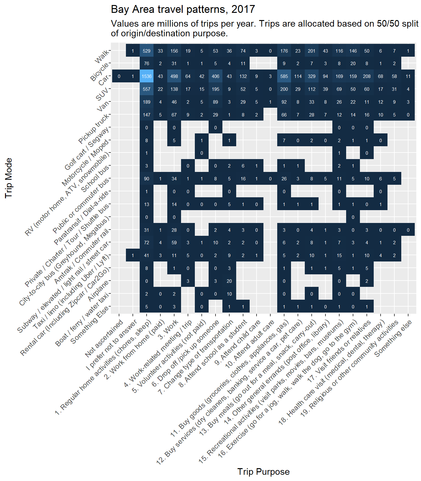
Notes:
y = reorder(mode_label, desc(mode_label))is done because, as we’ve encountered before,ggplot2tends to put the y-axis in the order we’d expect for number graphs, but in this case, we’d prefer to have the order read low to high from top to bottom.geom_tileandgeom_textare newly used here, but simulate a table.geom_tileprovides the color background to the cells.- Based on trial and error, I’ve decided to divide the raw trip counts by one million (
1e6) andround()the result so that the cell text is more legible. Having done this, it is then important to explain the units of the table in the subtitle of the plot. - While it would have been possible to shorten the axis labels in either axis, here I’m choosing to show them in full. It is therefore necessary to rotate the x-axis labels, otherwise they wouldn’t be legible at all.
axis.text.x = element_text(angle = 45, hjust = 1)happens to work well for 45 degree angle rotation. For 90 degree text, useaxis.text.x = element_text(angle = 90, vjust = 0.5, hjust = 1)
Now, having inspected the results, it appears that some refinements could be made:
- Based on our rounding, any trip counts less than
1e6/2, or 500,000, were rounded down to 0. To simplify the plot, we could remove these values completely, rendering themNAjust like many existing gaps in the plot. Doing this could also remove entire rows and columns from the plot. - Trip purposes 1 and 2 involve home as a start or as a destination. Every roundtrip, of course, includes starts and ends at home, so every trip in the dataset is accounted for (twice) in these columns. Since the focus of our analysis is on the reasons for travel that cause one to leave home, we don’t need the self-evident information captured in these columns, so they can be removed.
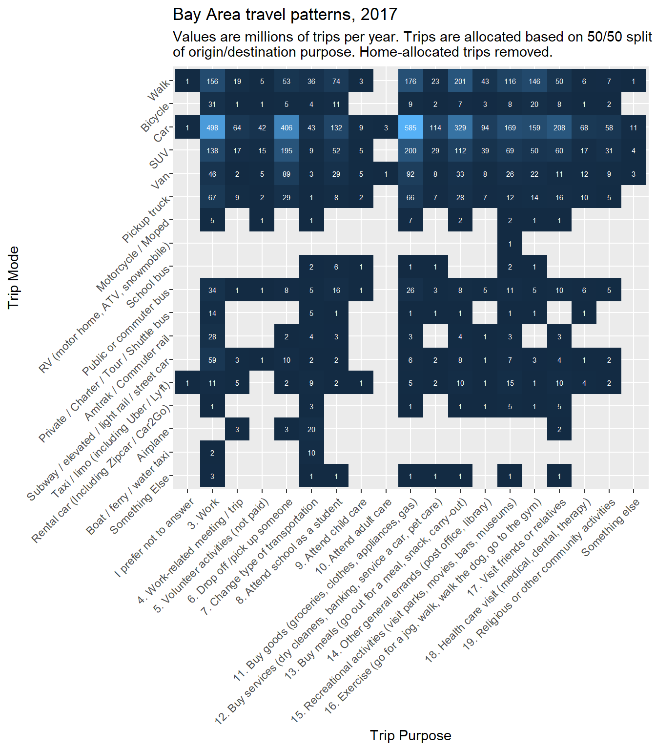
Let’s replot the previous information with these refinements as filters:
bay_trips_summary %>%
  filter(
    trips > 1e6/2,
    !purpose_label %in% c("1. Regular home activities (chores, sleep)", "2. Work from home (paid)")
  ) %>%
  ggplot(
    aes(
      x = purpose_label,
      y = reorder(mode_label, desc(mode_label))
    )
  ) +
  geom_tile(
    aes(fill = trips)
  ) +
  geom_text(
    aes(label = (trips/1e6) %>% round()),
    color = "white",
    size = 2
  ) +
  theme(
    legend.position = "none",
    axis.text.x = element_text(angle = 45, hjust = 1),
    axis.text.y = element_text(angle = 45, hjust = 1)
  ) +
  labs(
    x = "Trip Purpose",
    y = "Trip Mode",
    title = "Bay Area travel patterns, 2017",
    subtitle = "Values are millions of trips per year. Trips are allocated based on 50/50 split\nof origin/destination purpose. Home-allocated trips removed."
  )
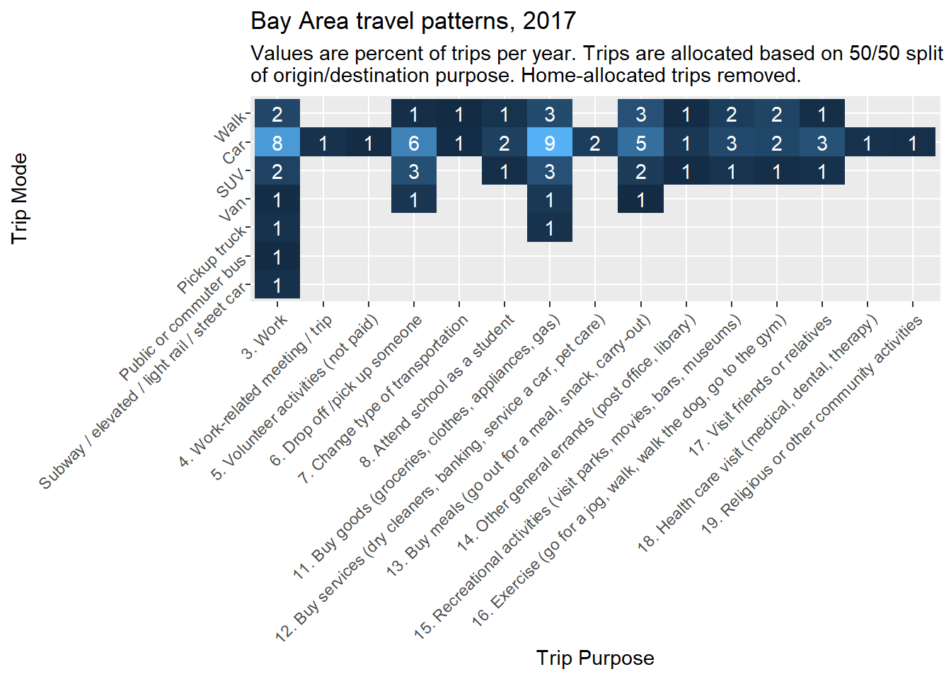
Here’s a similar plot, but of percent of trips instead of absolute count of trips. Notice the order of filter() and mutate() steps at the start so that the percents are based on all trips except home-allocated trips, and then the percents less than 1/2% are filtered out.
bay_trips_summary %>%
  filter(
    !purpose_label %in% c("1. Regular home activities (chores, sleep)", "2. Work from home (paid)")
  ) %>%
  mutate(
    trips_perc = trips/sum(trips)
  ) %>%
  filter(
    trips_perc > 0.005
  ) %>%
  ggplot(
    aes(
      x = purpose_label,
      y = reorder(mode_label, desc(mode_label))
    )
  ) +
  geom_tile(
    aes(fill = trips_perc)
  ) +
  geom_text(
    aes(label = (trips_perc*100) %>% round()),
    color = "white"
  ) +
  theme(
    legend.position = "none",
    axis.text.x = element_text(angle = 45, hjust = 1),
    axis.text.y = element_text(angle = 45, hjust = 1)
  ) +
  labs(
    x = "Trip Purpose",
    y = "Trip Mode",
    title = "Bay Area travel patterns, 2017",
    subtitle = "Values are percent of trips per year. Trips are allocated based on 50/50 split\nof origin/destination purpose. Home-allocated trips removed."
  )
Next, let’s process the table using trip miles instead of trip counts:
bay_trips_summary %>%
  filter(
    !purpose_label %in% c("1. Regular home activities (chores, sleep)", "2. Work from home (paid)"),
    tripmiles_wt > 1e7/2
  ) %>%
  ggplot(
    aes(
      x = purpose_label,
      y = reorder(mode_label, desc(mode_label))
    )
  ) +
  geom_tile(
    aes(fill = tripmiles_wt)
  ) +
  geom_text(
    aes(label = (tripmiles_wt/1e7) %>% round()),
    color = "white",
    size = 2
  ) +
  theme(
    legend.position = "none",
    axis.text.x = element_text(angle = 45, hjust = 1),
    axis.text.y = element_text(angle = 45, hjust = 1)
  ) +
  labs(
    x = "Trip Purpose",
    y = "Trip Mode",
    title = "Bay Area travel patterns, 2017",
    subtitle = "Values are tens of millions of trip miles per year. Trips are allocated based on 50/50 split\nof origin/destination purpose. Home-allocated trips removed."
  )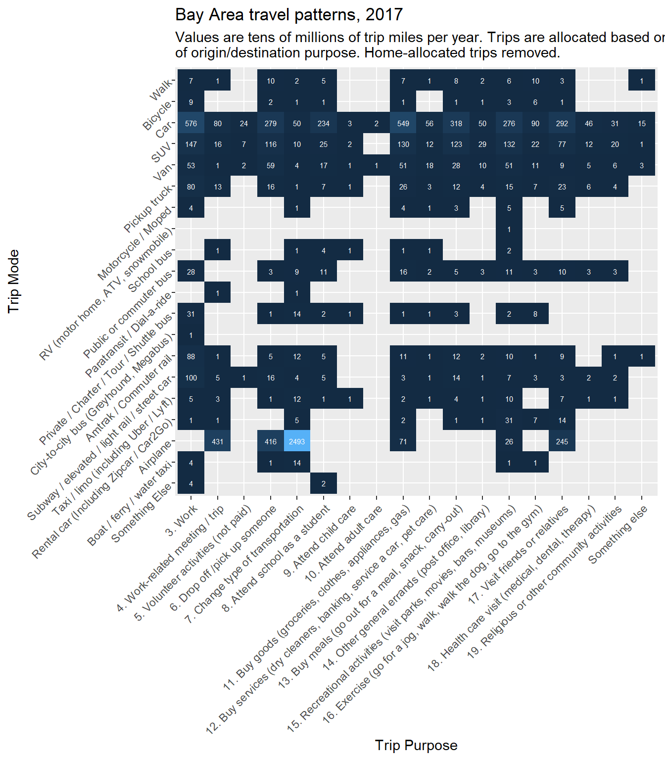
Notice that the Airplane row now clearly stands out, and may very well reflect the greater miles accrued by a smaller number of airplane trips. But if we would like our percentage breakdown to focus on non-air travel, then we can filter that category out below:
bay_trips_summary %>%
  filter(
    mode_label != "Airplane",
    !purpose_label %in% c("1. Regular home activities (chores, sleep)", "2. Work from home (paid)")
  ) %>%
  mutate(
    tripmiles_perc = tripmiles_wt/sum(tripmiles_wt)
  ) %>%
  filter(
    tripmiles_perc > 0.005
  ) %>%
  ggplot(
    aes(
      x = purpose_label,
      y = reorder(mode_label, desc(mode_label))
    )
  ) +
  geom_tile(
    aes(fill = tripmiles_perc)
  ) +
  geom_text(
    aes(label = (tripmiles_perc*100) %>% round()),
    color = "white"
  ) +
  theme(
    legend.position = "none",
    axis.text.x = element_text(angle = 45, hjust = 1),
    axis.text.y = element_text(angle = 45, hjust = 1)
  ) +
  labs(
    x = "Trip Destination",
    y = "Trip Mode",
    title = "Bay Area travel patterns, 2017",
    subtitle = "Values are percent of trip miles per year. Trips are allocated based on 50/50 split\nof origin/destination purpose. Home-allocated trips removed."
  )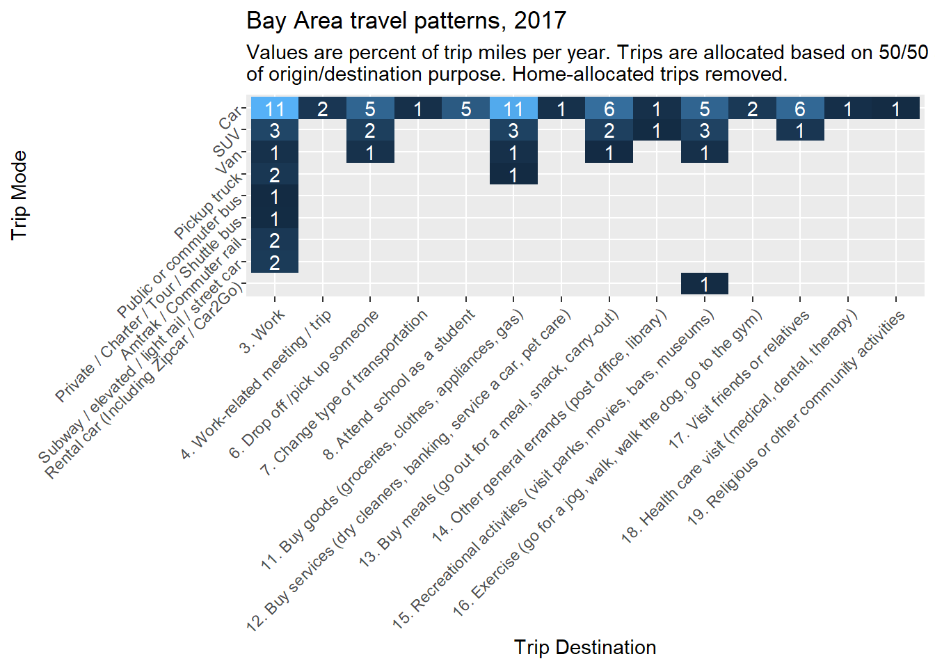
A conceptual takeaway from these tables is that work-related trips, or commute trips, are not the largest individual source of trips but are the largest individual source of trip miles. Also, of course, cars are the dominant mode of travel. These observations will inform some of our subsequent focus areas in this chapter, like commute-based travel data and car-based trip routing. Otherwise, this section has demonstrated how to begin analyzing the many rich layers of NHTS data, as well as how to create heat map tables in ggplot2.