3.4 Accessibility
Travel routing algorithms can also be used to create “isochrones”, which are bands of equal distance (or duration) travel from a central point. Depending on the algorithm, these can be significantly more efficient to compute than individual travel routes, since as one propagates movement from a central point, many routes are shared; or, an isochrone function will divide up a region into cells of a certain granularity, route to only those cells, and then connect the dots between results. Usually isochrone functions only differ in their underlying travel network accuracy and the resolution chosen for analysis.
mapboxapi, which we used in the previous section, can also be used to generate isochrones. For our demonstration, let’s source COVID testing sites from a countrywide volunteer effort by GIS Corps (keep in mind this dataset may not be up to date or correct). This ESRI-based API can be referenced using st_read() as we’ve done before, with the GEOJSON link that can be found on the page:
library(mapboxapi)
library(tidyverse)
library(tigris)
library(sf)
library(leaflet)
library(censusapi)

Sys.setenv(CENSUS_KEY="c8aa67e4086b4b5ce3a8717f59faa9a28f611dab")

acs_vars_2019_5yr <-
  listCensusMetadata(
    name = "2019/acs/acs5",
    type = "variables"
  )

covid_testing <-
  st_read("https://opendata.arcgis.com/datasets/d7d10caf1cec43e0985cc90fbbcf91cb_0.geojson")
Let’s filter these testing sites down to just the Bay Area, and only those that are considered open at the moment:
bay_county_names <-
  c(
    "Alameda",
    "Contra Costa",
    "Marin",
    "Napa",
    "San Francisco",
    "San Mateo",
    "Santa Clara",
    "Solano",
    "Sonoma"
  )

bay_counties <-
  counties("CA", cb = T, progress_bar = F) %>%
  filter(NAME %in% bay_county_names) %>%
  st_transform(st_crs(covid_testing))

bay_covid_testing <-
  covid_testing %>%
  .[bay_counties, ] %>%
filter(status == "Open")leaflet() %>%
addProviderTiles(providers$CartoDB.Positron) %>%
addCircleMarkers(
data = bay_covid_testing,
radius = 1,
label = ~name
)And to simplify the demonstration, let’s further filter to just Santa Clara County:
The function mb_isochrone() is straightforward to use on an sf object, as shown:
walk_10min <- mb_isochrone(
  scc_covid_testing,
  profile = "walking",
  time = 10
)

scc_covid_testing_walk_10min <-
  scc_covid_testing %>%
  st_drop_geometry() %>%
  cbind(walk_10min$geometry) %>%
st_as_sf()leaflet() %>%
addMapboxTiles(
style_id = "streets-v11",
username = "mapbox"
) %>%
addPolygons(
data = scc_covid_testing_walk_10min,
label = ~name
)Now, similar to an Intro chapter, let’s intersect these isochrones with CBGs and compare the profile of the population that is within 10 minute walking distance of a COVID testing site to the population of Santa Clara County as a whole. Recall that the key assumption in this technique is that a population is homogeneously distributed within CBGs (but this assumption can be further refined using techniques from the Land Use chapter). Note the use of st_union() below to merge all the isochrone areas into one polygon, since we don’t need to retain the specific attribution of test sites in this analysis, and since we don’t want overlap in isochrones to create duplicate results (although your measure of accessibility could be designed to account for the value of having more than one location within walking distance).
scc_bgs <-
  block_groups("CA","085", cb = T, progress_bar = F) %>%
  st_transform(26910) %>%
  mutate(original_area = st_area(.))

scc_bg_isochrone_intersect <-
  scc_bgs %>%
  st_intersection(
    scc_covid_testing_walk_10min %>%
      st_union() %>%
      st_transform(26910)
  ) %>%
  mutate(
    leftover_area = st_area(.),
    perc_area = leftover_area / original_area
  )

scc_bg_income <-
  getCensus(
    name = "acs/acs5",
    vintage = 2019,
    region = "block group:*",
    regionin = "state:06+county:085",
    vars = "group(B19001)"
  ) %>%
  mutate(cbg = paste0(state,county,tract,block_group)) %>%
  select(!c(GEO_ID,state,county,tract,block_group,NAME) & !ends_with(c("EA","MA","M"))) %>%
  pivot_longer(
    ends_with("E"),
    names_to = "variable",
    values_to = "estimate"
  ) %>%
  left_join(
    acs_vars_2019_5yr %>%
      select(name, label),
    by = c("variable" = "name")
  ) %>%
  select(-variable) %>%
  separate(
    label,
    into = c(NA,NA,"income"),
    sep = "!!"
  ) %>%
  filter(!is.na(income)) %>%
  mutate(
    income = case_when(
      income %in% c("Less than $10,000","$10,000 to $14,999","$15,000 to $19,999","$20,000 to $24,999") ~ "Less than $25,000",
      income %in% c("$25,000 to $29,999","$30,000 to $34,999","$35,000 to $39,999","$40,000 to $44,999","$45,000 to $49,999") ~ "$25,000 to $49,999",
      income %in% c("$50,000 to $59,999","$60,000 to $74,999") ~ "$50,000 to $74,999",
      TRUE ~ income
    )
  )

scc_income <-
  scc_bg_income %>%
  mutate(income = factor(income, levels = unique(scc_bg_income$income))) %>%
  group_by(income) %>%
  summarize(estimate = sum(estimate)) %>%
  mutate(
    perc = estimate/sum(estimate),
    group = "Full Population"
  )

scc_covid_income <-
  scc_bg_income %>%
  mutate(income = factor(income, levels = unique(scc_bg_income$income))) %>%
  left_join(
    scc_bg_isochrone_intersect %>%
      select(cbg = GEOID, perc_area) %>%
      st_drop_geometry()
  ) %>%
  filter(!is.na(perc_area)) %>%
  mutate(
    estimate = estimate * perc_area
  ) %>%
  group_by(income) %>%
  summarize(estimate = sum(estimate)) %>%
  mutate(
    perc = estimate/sum(estimate),
    group = "Population within 10 min. walk of COVID-19 testing"
)## 0.1727551 [1]The output above is the estimated percent of population in Santa Clara County within 10 minutes walk of COVID-19 testing. This itself may be a metric worth increasing as a public goal. Now let’s use ggplot to produce a pie chart comparison of full population vs. test-accessible population, in terms of income distribution:
rbind(scc_income,scc_covid_income) %>%
  ggplot(
    aes(
      x = "",
      y = perc,
      fill = reorder(income,desc(income))
    )
  ) +
  geom_bar(
    stat = "identity",
    position = position_fill()
  ) +
  geom_text(
    aes(label = paste0(round(perc*100),"%")),
    position = position_fill(vjust = 0.5)
  ) +
  coord_polar(theta = "y") +
  facet_wrap(~ group)  +
  theme(
    axis.title.x = element_blank(),
    axis.title.y = element_blank(),
    legend.position = 'bottom'
  ) +
  guides(
    fill = guide_legend(nrow=3, byrow=TRUE)
  ) +
  labs(
    fill = "Household\nIncome"
  )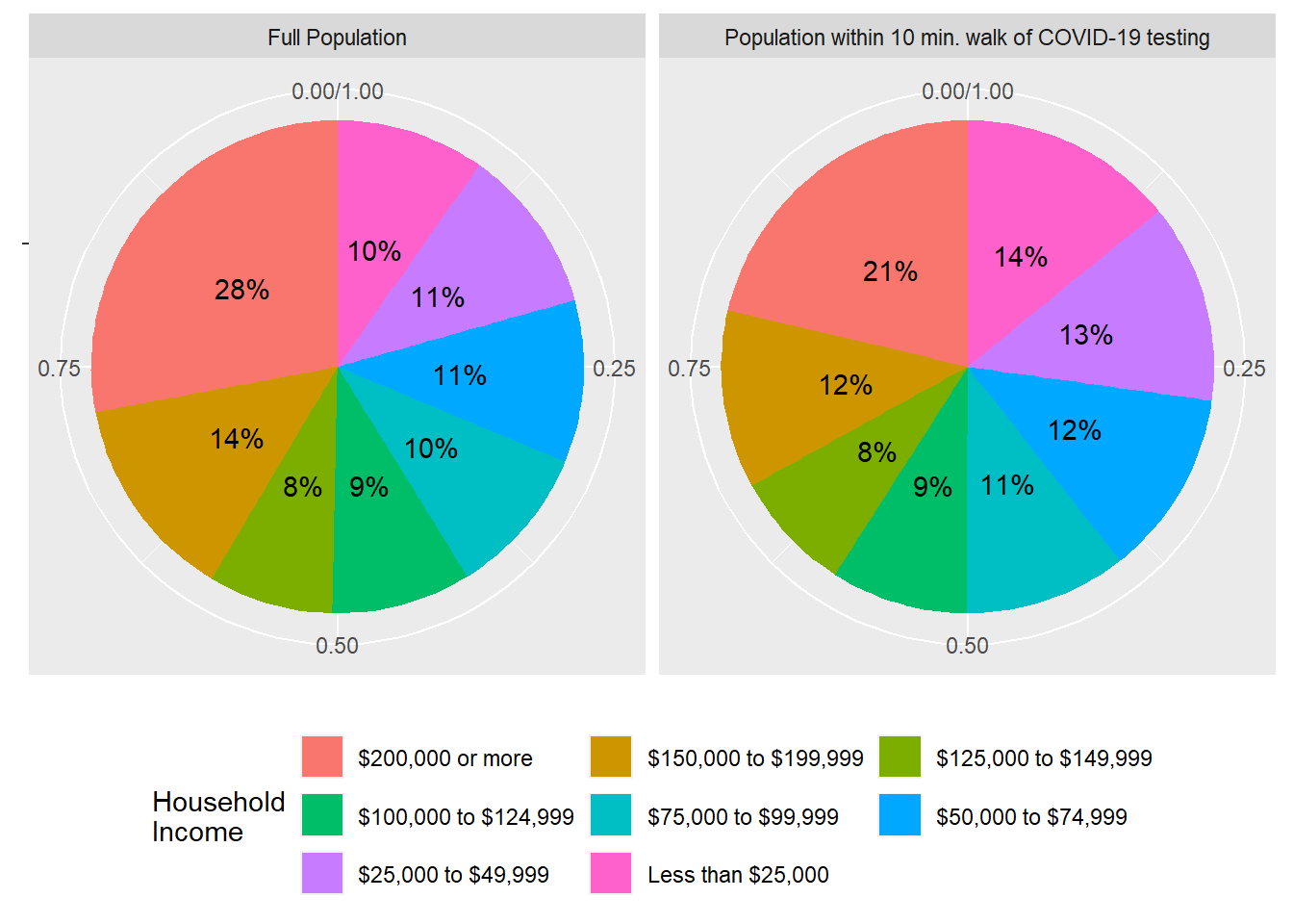
It does appear that on the whole, the locations of COVID-19 testing sites in Santa Clara County are favored towards lower income households. It may be a further goal of the County to actually make this distribution even more “inequitable” with respect to income, since lower-income households may benefit more from walking access to testing. The GISCorps organization also produced an open-source vaccine location dataset, which you are encouraged to use to further practice this accessibility technique.