5.1 Hazard data
The first key input for hazard risk analysis is data that describes the hazard through spatiotemporal “intensity measures”. If we focus on hazards that are discrete events, then we would expect that for a given event, whether it happened in the past or is predicted to happen in the future, we could geospatially visualize the boundary of that hazard, and for every point within that boundary, we could assign a non-zero value that describes whatever kind of physics is of particular concern to us. Depending on the hazard, there may be multiple kinds of intensity measures; for example, in a hurricane, we might be able to describe wind speeds at every point in space, as well as floor depth, as well as flood duration. Depending on data availability, we may have detailed empirical measurements, or best approximations through models, or just barely enough of a ballpark guess to do any meaningful risk analysis at all. But the focus of the “hazard” step of SURF is to identify one or more intensity measures of concern and collect as many representations of hazard events as possible. And for predicted events in the future, we will also need to be able to attach probabilities of occurrence to events of different intensities.
5.1.1 Wildfires
Our first example of hazard data collection is wildfires. CalFire’s site appears to have a comprehensive record of wildfire incidents, including date, some loss information, and, at least for active fires of interest, geometries of the burn perimeter. There are download links at the bottom of the site, but they don’t appear to contain boundary information, just latitude and longitude. If we wanted to read the perimeters, say to investigate communities and physical assets within the exposure zone (which you should be able to carry out using the techniques in this curriculum so far), we need to dig deeper to access this information. Note the Esri branding on the map; this is a promising signal that, with the right searching, we can find a backend ArcGIS service that enables reading of the underlying geometry data. The link does not show up anywhere on this page, but if, on your browser, you navigate to “Developer Tools” (different ways depending on your browser), and Ctrl+F search for the phrase “arcgis/rest/services”, you should be able to spot a URL that looks like “https://services3.arcgis.com/T4QMspbfLg3qTGWY/arcgis/rest/services/Current_WildlandFire_Perimeters/FeatureServer/0”. The snippet “Current_WildlandFire_Perimeters” is the clue that this is likely useful for us. Navigating to this URL (with everything up to the “/0”) gets you to a common kind of file storage system called ArcGIS REST Services. Many governments use ArcGIS to power their mapping activities, and often ArcGIS maps and dashboards are built off of data that is hosted in this type of directory, which average web users will never be directed to, but where data analysts can extract raw data (assuming the organization has provided public access). The “Supported Operations” at the bottom are like APIs that you can use to pull data, but here we’ll take advantage of a package called esri2sf to grab sf objects out of any ArcGIS Feature Server that contains polygons.
Also note that if you step one level up, to “https://services3.arcgis.com/T4QMspbfLg3qTGWY/ArcGIS/rest/services”, you get a list of all published maps by this organization (CalFIRE). There is no systematic organization here, but with some diligence and common sense, you’ll discover that the item named fire_perimeters_all is, as you may suspect, all historical fire perimeters (up through 2020).
library(remotes)
install_github("yonghah/esri2sf")
library(tidyverse)
library(sf)
library(leaflet)
library(mapboxapi)
library(tigris)
library(jsonlite)
library(esri2sf)ca_fires <- esri2sf("https://services3.arcgis.com/T4QMspbfLg3qTGWY/ArcGIS/rest/services/fire_perimeters_all/FeatureServer/0")Make sure to provide the URL up to the “/0”. Let’s filter to the Bay Area and plot:
bay_county_names <-
c(
"Alameda",
"Contra Costa",
"Marin",
"Napa",
"San Francisco",
"San Mateo",
"Santa Clara",
"Solano",
"Sonoma"
)
bay_counties <-
counties("CA", cb = T, progress_bar = F) %>%
filter(NAME %in% bay_county_names) %>%
st_transform(4326)
bay_fires <-
ca_fires %>%
st_make_valid() %>%
.[bay_counties, ]
bay_fires_recent <- bay_fires %>%
filter(as.numeric(YEAR_) >= 2010)year_pal <- colorNumeric(
palette = "OrRd",
domain = as.numeric(bay_fires_recent$YEAR_)
)
leaflet() %>%
addMapboxTiles(
style_id = "satellite-streets-v11",
username = "mapbox",
options = tileOptions(opacity = 0.5)
) %>%
addPolygons(
data = bay_fires_recent %>%
mutate(YEAR = as.numeric(YEAR_)),
color = ~year_pal(YEAR),
label = ~paste0(YEAR,": ",FIRE_NAME)
)I’ll leave you to explore this dataset on your own. Wildfire hazard data is unique in the sense that the “intensity measure” is essentially absolute, in/out of the boundary. It also is difficult to model predictively, leaving us with broad “fire threat zones” from similar public sources, and the concept of a “wildland urban interface” (WUI) as a proxy for risky areas.
Wildfires also cause significant downstream hazards in the form of air pollution. Otherwise, the main sources of focus would be commercial and industrial point sources, as well as moving sources like vehicle exhaust. If we can identify particular urban areas that are regularly exposed to higher levels of air pollution, such as residences and schools near highways or factories, then we can direct attention to the long-term health impacts of this exposure and target equity-oriented action.
5.1.2 Air Pollution
Unfortunately, air pollution analysis has often been coarse, given the lack of air monitoring stations or other kinds of data collection. But a recent company, PurpleAir, is a notable example of a private-sector entity that has made cost-effective indoor and outdoor PM2.5 sensors available to the broad consumer market. In the Bay Area, there are now thousands of PurpleAir sensors, which is giving academics and the public alike unprecedentedly detailed data on air pollution in an easily accessible format.
We’ll make use of PurpleAir’s API. To do so, at the time of writing, you’ll need to send an email to contact@purpleair.com requesting your own API key. Then, based on their API documentation, you can write the following request in the form of a URL and receive a JSON file, which you can convert using fromJSON:
library(jsonlite)
pa_api <- "YOUR_KEY_HERE"
json <- fromJSON(paste0(
"https://api.purpleair.com/v1/sensors?api_key=",
pa_api,
"&fields=name,location_type,latitude,longitude,pm2.5_1week,temperature,humidity,primary_id_a,primary_key_a,secondary_id_a,secondary_key_a,primary_id_b,primary_key_b,secondary_id_b,secondary_key_b"
))
all_sensors <- json %>%
.$data %>%
as.data.frame() %>%
set_names(json$fields) %>%
filter(
!is.na(longitude),
!is.na(latitude)
) %>%
st_as_sf(coords = c("longitude","latitude"), crs = 4326) %>%
mutate(location_type = ifelse(
location_type == 0,
"outside",
"inside"
))This loads all PurpleAir sensors, including lat/long and some sensor information.
Next let’s filter to just the Bay Area, based on lat/long.
bay_sensors <-
all_sensors %>%
.[bay_counties, ]It looks like a significant portion of all PurpleAir sensors are in the Bay Area. Note that in the API call I grabbed the field pm2.5_1week, which is a 1-week average of PM2.5 from the two channels (or just one channel if the sensor is indoors). Other data can be pulled from the API as well. At this point we can apply a conversion recommended by PurpleAir, produced by the EPA (to better match the composition of pollution expected in a place like the Bay Area, relative to Salt Lake City, where PurpleAir is based). We can also translate the PM2.5 values into AQI. (For deeper analyses, you may additionally consider removing individual sensors that have questionable data, like extreme temperature or humidity values, or large differences between the A/B channels, or individual outliers that might be sensors placed near exhaust vents).
bay_sensors_clean <- bay_sensors %>%
filter(
!is.na(pm2.5_1week),
!is.na(humidity)
) %>%
mutate(
PM25 = 0.524*as.numeric(pm2.5_1week) - 0.0852*as.numeric(humidity) + 5.72,
AQI = case_when(
PM25 <= 12 ~
paste(round(50/12*PM25), "Good"),
PM25 <= 35.4 ~
paste(round((100-51)/(35.4-12)*(PM25 - 12) + 51), "Moderate"),
PM25 <= 55.4 ~
paste(round((150-101)/(55.4-35.4)*(PM25 - 35.4) + 101), "Moderately Unhealthy"),
PM25 <= 150.4 ~
paste(round((200-151)/(150.4-55.4)*(PM25 - 55.4) + 151), "Unhealthy"),
PM25 <= 250.4 ~
paste(round((300-201)/(250.4-150.4)*(PM25 - 150.4) + 201), "Very Unhealthy"),
TRUE ~
paste(round((500-301)/(500.4-250.5)*(PM25 - 250.5) + 301), "Hazardous")
)
) %>%
separate(
AQI,
into = c("AQI","AQI_Cat"),
sep = " ",
extra = "merge"
) %>%
mutate(
AQI = as.numeric(AQI),
AQI_Cat = AQI_Cat %>% factor(levels = c("Good", "Moderate","Moderately Unhealthy","Unhealthy","Very Unhealthy","Hazardous"))
)Let’s map just the outdoor sensors, using colorFactor() to match the AQI categories.
aqi_pal <- colorFactor(
palette = "RdYlGn",
reverse = T,
domain = bay_sensors_clean$AQI_Cat
)
bay_sensors_clean %>%
filter(location_type == "outside") %>%
leaflet() %>%
addProviderTiles(provider = providers$CartoDB.Positron) %>%
addCircleMarkers(
color = ~aqi_pal(AQI_Cat),
label = ~AQI_Cat,
radius = 5,
opacity = 0.75
) %>%
addLegend(
pal = aqi_pal,
values = ~AQI_Cat
)It turns out that at the time of this demonstration (2/13/22), the weekly average for pretty much all of the Bay Area was in well within a “good” AQI range, so the map shows up as a sea of green. If we want to focus our attention on differences, we can set our pal to be a colorQuantile() instead, with 5 bins:
aqi_pal2 <- colorQuantile(
palette = "RdYlGn",
reverse = T,
domain = bay_sensors_clean$AQI,
n = 5
)
bay_sensors_clean %>%
leaflet() %>%
addProviderTiles(provider = providers$CartoDB.Positron) %>%
addCircleMarkers(
color = ~aqi_pal2(AQI),
label = ~paste0(AQI,", ",AQI_Cat),
radius = 5,
opacity = 0.75
) %>%
addLegend(
pal = aqi_pal2,
values = ~AQI
)Keep in mind that at this point, the “red” points do not necessarily have “bad” air quality in the AQI sense, just “worse” relative to the green points.
Now let’s consider how this point data can be converted to average air quality information for census geographies, like CBGs. This involves first interpolating air quality information for all the points on the map that don’t have PurpleAir sensors, and then averaging this information over the area of polygons.
Let’s first demonstrate a classic technique for interpolating information around a limited set of points, even though it is not necessarily the best technique for our case. In principle, we would simply assign each unmarked point the value of the nearest PurpleAir sensor, which visually would look like a network of irregularly-shaped cells around our PurpleAir points. This technique goes by many names, but we’ll call it “Voronoi polygons” since this name is encoded into the function st_voronoi() within sf, which receives a single-row “MULTIPOINT” sf object. We can make this out of our many-row dataframe using st_union().
bay_pm25_voronoi <-
bay_sensors_clean %>%
filter(location_type == "outside") %>%
st_union() %>%
st_voronoi() %>%
st_cast() %>%
st_as_sf() %>%
st_intersection(.,st_union(bay_counties)) %>%
st_join(bay_sensors_clean %>% filter(location_type == "outside"))
ggplot(bay_pm25_voronoi) + geom_sf() 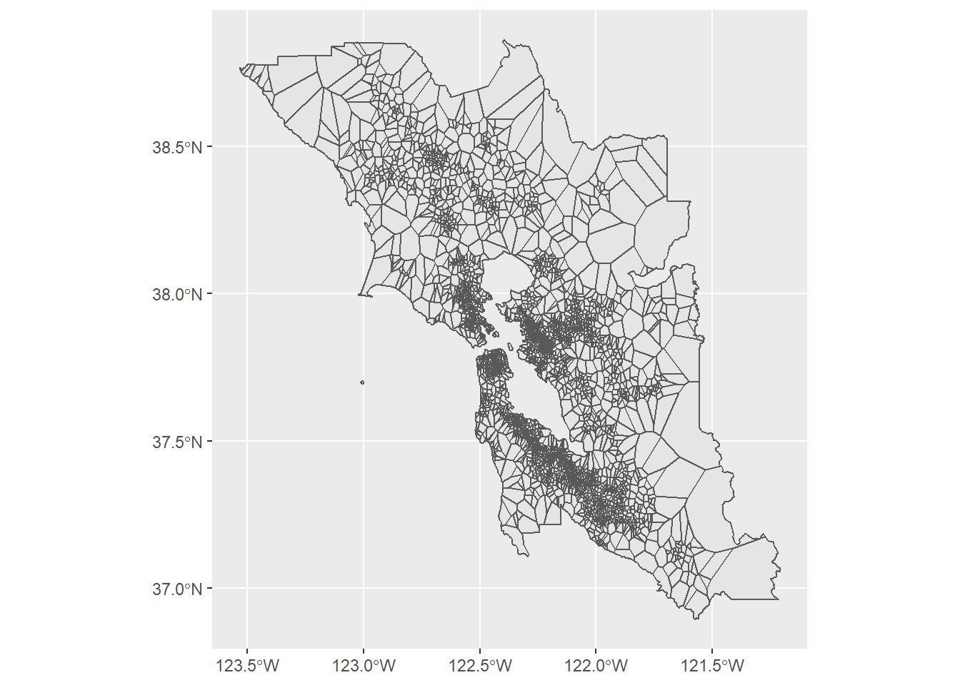
Note that after we get a result out of st_voronoi(), the result is not a normal sf object anymore (rather a more elemental class), so we use st_cast() combined with st_as_sf() to convert it back to our familiar sf class. From there, we use st_intersection() on the st_union() of the Bay Area counties, which essentially cuts the full rectangle-shaped bounds of the voronoi result to just the Bay Area boundary. The last step is to st_join() the object back to the original PurpleAir points so that each voronoi polygon receives the attributes of the original data, most importantly the PM2.5 information.
From here, since we are working with polygons of uniform PM2.5 value, we could use st_intersection() again to cut these voronois by CBGs, similar to our spatial subsetting technique, and produce weighted averages of PM2.5 for each CBG based on the area of constituent voronoi polygons. We’ll focus on just San Francisco to reduce the computational complexity of this demonstration.
sf_cbgs <- block_groups("CA","San Francisco", cb = T, progress_bar = F) %>%
st_transform(4326)
sf_pm25_voronoi_cbg <-
bay_pm25_voronoi %>%
st_intersection(sf_cbgs) %>%
st_make_valid() %>%
mutate(
area = st_area(.) %>% as.numeric()
) %>%
st_drop_geometry() %>%
group_by(GEOID) %>%
summarize(
PM25 = weighted.mean(PM25, area, na.rm = T)
) %>%
left_join(sf_cbgs %>% dplyr::select(GEOID)) %>%
st_as_sf()Note that the summarize() above, in addition to producing a new PM25 result, also merges the associated geometries under the grouping of GEOID, which happens to bring us back to CBG geometries. The weighted.mean() accounts for the relative area of the voronoi polygons subsetted within each CBG.
Let’s map these CBG results, along with the original PurpleAir point sensor data. For the pal, we’ll combine the domains of the original PurpleAir data and the voronoi results, so the minimum and maximum of either are captured in the color range.
sf_sensors <-
bay_sensors_clean %>%
filter(location_type == "outside") %>%
.[sf_cbgs, ]pm25_pal <- colorNumeric(
palette = "RdYlGn",
reverse = T,
domain = c(
sf_pm25_voronoi_cbg$PM25,
sf_sensors$PM25
)
)
leaflet() %>%
addProviderTiles(provider = providers$CartoDB.Positron) %>%
addPolygons(
data = sf_pm25_voronoi_cbg %>%
filter(GEOID != "060759804011"), # Farallon Islands
fillColor = ~pm25_pal(PM25),
fillOpacity = 0.5,
color = "white",
weight = 0.5,
label = ~PM25,
highlightOptions = highlightOptions(
weight = 2,
opacity = 1
)
) %>%
addCircleMarkers(
data = sf_sensors,
fillColor = ~pm25_pal(PM25),
fillOpacity = 1,
color = "black",
weight = 0.5,
radius = 5,
label = ~PM25
) %>%
addLegend(
pal = pm25_pal,
values = c(
sf_pm25_voronoi_cbg$PM25,
sf_sensors$PM25
)
)There are many other ways to interpolate between sensors that are more sophisticated than the voronoi approach. You might want to account for the fact that air pollution dissipates in some kind of inverse relationship to distance; but you may also want to consider consider each sensor less as an emissions source and more as a signal of larger air flow trends. To fully account for this complexity is beyond the scope of this chapter, but a good next geostatistical technique to research on your own is “kriging”.
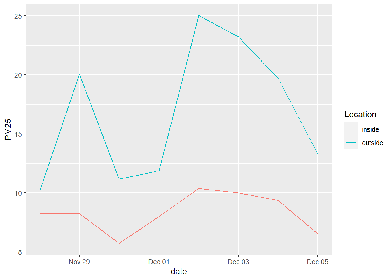
Next, we’ll show how to retrieve data further back in time from PurpleAir. If you want to conduct more detailed longitudinal analysis, or produce averages over a longer timescale than just the past week, then the standard dataset we’ve used so far won’t be adequate. The ThingSpeak API, which PurpleAir uses to store historical data, allows you to specify, for a subset of sensors, a start date and end date of data from 10 minute intervals up to daily intervals, and receive various PM2.5, temperature, and humidity measurements. This would take a while to do for all sensors in the Bay Area, so I’d recommend focusing your inquiry. In the example below, I take just the 24 sensors registered on Stanford campus as of writing (feel free to look for them on the PurpleAir site yourself), both outdoor and indoor, and download daily data from one week at the end of last year (when there was reported poor air quality in the Bay Area).
stanford_boundary <- places("CA", cb = T) %>%
filter(NAME == "Stanford") %>%
st_transform(4326)
stanford_sensors <- bay_sensors_clean %>%
.[stanford_boundary,]
start <- "2021-11-28%2000:08:00"
end <- "2021-12-05%2000:08:00"
stanford_sensor_data <-
1:nrow(stanford_sensors) %>%
map_dfr(function(row){
print(paste0(row,". ",stanford_sensors[row,]$sensor_index))
a1 <- read_csv(paste0(
"https://api.thingspeak.com/channels/",
stanford_sensors[row,]$primary_id_a,
"/feeds.csv?api_key=",
stanford_sensors[row,]$primary_key_a,
"&average=1440&round=3&start=",start,
"&end=", end,
"&timezone=America/Los_Angeles"
), show_col_types = F) %>%
set_names(c("created_at","PM1.0_CF_1_ug/m3_A","PM2.5_CF_1_ug/m3_A","PM10.0_CF_1_ug/m3_A","Uptime_Minutes_A","RSSI_dbm_A","Temperature_F_A","Humidity_%_A","PM2.5_CF_ATM_ug/m3_A"))
a2 <- read_csv(paste0(
"https://api.thingspeak.com/channels/",
stanford_sensors[row,]$secondary_id_a,
"/feeds.csv?api_key=",
stanford_sensors[row,]$secondary_key_a,
"&average=1440&round=3&start=",start,
"&end=", end,
"&timezone=America/Los_Angeles"
), show_col_types = F) %>%
set_names(c("created_at","0.3um/dl_A","0.5um/dl_A","1.0um/dl_A","2.5um/dl_A","5.0um/dl_A","10.0um/dl_A","PM1.0_CF_ATM_ug/m3_A","PM10_CF_ATM_ug/m3_A"))
b1 <- read_csv(paste0(
"https://api.thingspeak.com/channels/",
stanford_sensors[row,]$primary_id_b,
"/feeds.csv?api_key=",
stanford_sensors[row,]$primary_key_b,
"&average=1440&round=3&start=",start,
"&end=", end,
"&timezone=America/Los_Angeles"
), show_col_types = F) %>%
set_names(c("created_at","PM1.0_CF_1_ug/m3_B","PM2.5_CF_1_ug/m3_B","PM10.0_CF_1_ug/m3_B","HEAP_B","ADC0_voltage_B","Atmos_Pres_B","Not_Used_B","PM2.5_CF_ATM_ug/m3_B"))
b2 <- read_csv(paste0(
"https://api.thingspeak.com/channels/",
stanford_sensors[row,]$secondary_id_b,
"/feeds.csv?api_key=",
stanford_sensors[row,]$secondary_key_b,
"&average=1440&round=3&start=",start,
"&end=", end,
"&timezone=America/Los_Angeles"
), show_col_types = F) %>%
set_names(c("created_at","0.3um/dl_B","0.5um/dl_B","1.0um/dl_B","2.5um/dl_B","5.0um/dl_B","10.0um/dl_B","PM1.0_CF_ATM_ug/m3_B","PM10_CF_ATM_ug/m3_B"))
combined <- a1 %>%
left_join(a2, by = "created_at") %>%
left_join(b1, by = "created_at") %>%
left_join(b2, by = "created_at") %>%
transmute(
date = as.Date(created_at),
ID = as.numeric(stanford_sensors[row,]$sensor_index),
Location = stanford_sensors[row,]$location_type,
PM25 = 0.524*as.numeric(`PM2.5_CF_1_ug/m3_A`) - 0.0852*as.numeric(`Humidity_%_A`) + 5.72
)
}) %>%
group_by(date, Location) %>%
summarize(
PM25 = mean(PM25, na.rm = T)
)The API calls are set up according to the ThingSpeak API. The necessary IDs and keys are part of the original PurpleAir JSON. The exact fields are broken up into different fields because the ThingSpeak channels have an 8-field limit. The field headers can be determined here. These ThingSpeak calls can be retrieved as CSVs.
stanford_sensor_data %>%
ggplot() +
geom_line(
aes(
x = date,
y = PM25,
color = Location
)
)
5.1.3 Extreme Heat
Let’s now turn to Cal-Adapt, a comprehensive source of hazard forecasts which also has a robust API. Under their “Climate Indicator” offerings, we can access data on cooling and heating degree days (which we briefly mentioned in Chapter 4), extreme heat days, and extreme precipitation days. Let’s demonstrate how to structure inputs for the API for extreme heat days. The link provides the following example request: “/api/series/tasmax_day_HadGEM2-ES_rcp85/exheat/?g=POINT(-121.46+38.59)”. This is akin to typing “https://api.cal-adapt.org/api/series/tasmax_day_HadGEM2-ES_rcp85/exheat/?g=POINT(-121.46+38.59)” into your browser, which will provide you a raw JSON. The following features of this string are relevant to us:
tasmax_dayprovides us with extreme heat days, specifically.HadGEM2_ESis one of four models used by California’s Climate Action Team for projecting future climate. This one is a “warm/dry simulation”, whileCanESM2is an “average simulation”.- After
?g=is geometry information in WKT form, with spaces replaced by+. We can convert our CBG shape into a string formatted this way. I found that there is a limit to the size of this string, though, which is breached around 100 points per geometry, so we’ll need to simplify certain polygons usingst_simplify()when we process many CBGs. - This format also means that any CBGs that might be MULTIPOLYGONs (two separate shapes) will need to be split into two portions.
- According to the API documentation, we can also add
&stat=meanto our API call to average out the results if our polygon crosses multiple “cells” for which they report data (cells being about 3.7 miles wide).
Let’s pick a test CBG and develop the code necessary to pull data from the API:
smc_cbgs <-
block_groups("CA","San Mateo County", cb = T) %>%
st_cast("MULTIPOLYGON") %>%
st_cast("POLYGON")
projection <- "+proj=utm +zone=10 +ellps=GRS80 +datum=NAD83 +units=ft +no_defs"
test_cbg <-
smc_cbgs %>%
filter(GEOID == "060816076003") %>%
pull(geometry) %>%
st_transform(projection) %>%
st_simplify(
dTolerance = ifelse(
npts(.) > 100,
400,
0
)
) %>%
st_transform(4326) %>%
st_as_text() %>%
str_replace_all(" ","+")
test_exheat <-
fromJSON(
paste0(
"https://api.cal-adapt.org/api/series/tasmax_day_CanESM2_rcp85/exheat/?g=",
test_cbg,
"&stat=mean"
)
) %>%
.$counts %>%
unlist() %>%
as.data.frame() %>%
rownames_to_column() %>%
rename(
year = rowname,
exheat = "."
) %>%
mutate(
year = substr(year,1,10) %>% as.Date()
)Notes:
st_simplify()requires the geometry be in a projected coordinate system.npts()gets the number of vertices in a geometry object.dToleranceis a tolerance parameter, in feet. The effect will be to cut some corners in the original shape to reduce the number of points. The number400is arbitrary here; I played with this number in running all SMC CBGs later, and it was the lowest number in the hundreds necessary to successfully run all CBGs. You can expect to sometimes need to manually adjust a parameter like this to help your analysis run most efficiently.st_as_text()converts the geometry column into a WKT string.str_replace_all()then removes and replaces parts of the string, in our case spaces with “+”s as needed in the API call.- The output of
fromJSONis a list, where the information we’re interested in is within a sublist named “counts”.
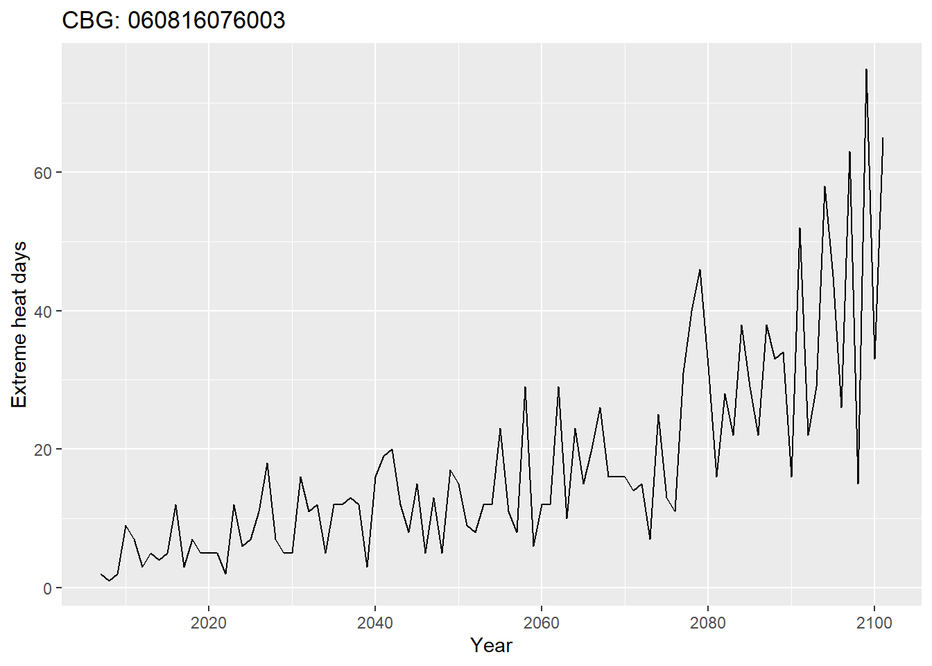
Let’s see what this raw data looks like for one CBG:
test_exheat %>%
ggplot(
aes(
x = year,
y = exheat
)
) +
geom_line() +
labs(
x = "Year",
y = "Extreme heat days",
title = "CBG: 060816076003"
)
Now, let’s package this into a for loop to run through all CBGs in SMC.
exheat_full <- NULL
for(row in 1:nrow(smc_cbgs)) {
print(row)
temp <-
fromJSON(
paste0(
"https://api.cal-adapt.org/api/series/tasmax_day_CanESM2_rcp85/exheat/?g=",
smc_cbgs[row, ]$geometry %>%
st_transform(projection) %>%
st_simplify(
dTolerance = ifelse(
npts(smc_cbgs[row, ]$geometry) > 100,
400,
0
)
) %>%
st_transform(4326) %>%
st_as_text() %>%
str_replace_all(" ","+"),
"&stat=mean"
)
) %>%
.$counts %>%
unlist() %>%
as.data.frame() %>%
rownames_to_column() %>%
rename(
year = rowname,
exheat = "."
) %>%
mutate(
year = substr(year,1,10) %>% as.Date(),
cbg = smc_cbgs[row,]$GEOID
)
exheat_full <-
exheat_full %>%
rbind(temp)
if(row%%10 == 0) {
saveRDS(exheat_full, "exheat_full.rds")
}
}
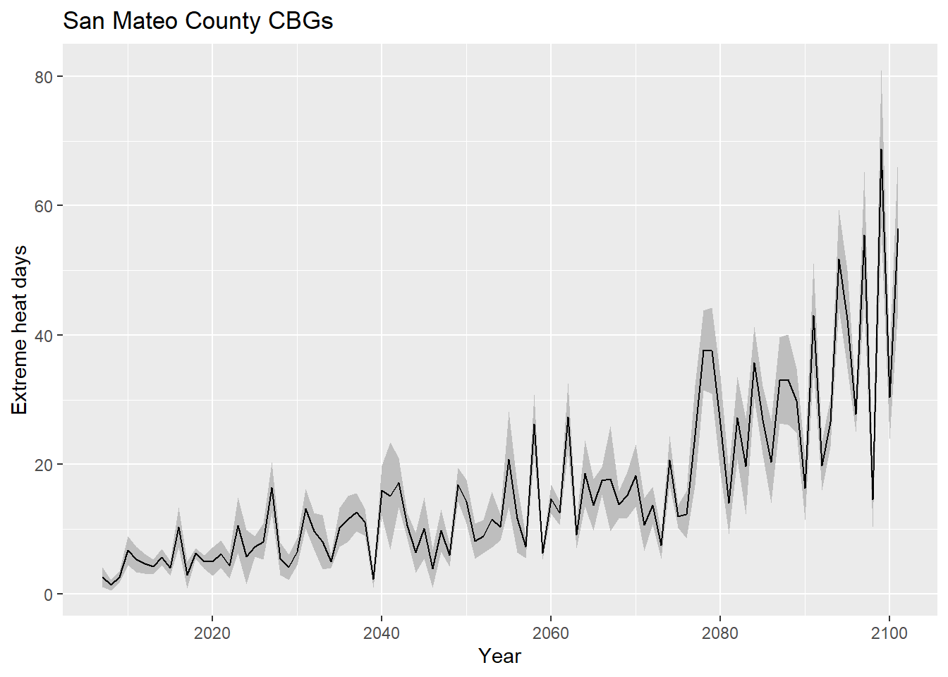
saveRDS(exheat_full, "exheat_full.rds")The following ggplot() demonstrates the use of geom_ribbon to create a +/-1 standard deviation band:
exheat_full %>%
group_by(year) %>%
summarize(
exheat_mean = mean(exheat, na.rm = T),
exheat_sd = sd(exheat, na.rm = T)
) %>%
ggplot(
aes(
x = year
)
) +
geom_ribbon(
aes(
ymin = exheat_mean - exheat_sd,
ymax = exheat_mean + exheat_sd
),
fill = "grey"
) +
geom_line(
aes(
y = exheat_mean
)
) +
labs(
x = "Year",
y = "Extreme heat days",
title = "San Mateo County CBGs"
)
And let’s also map the mean extreme heat days per year, in the 2020s:
exheat_2020s <-
exheat_full %>%
filter(year >= "2020-01-01" & year < "2030-01-01") %>%
group_by(cbg) %>%
summarize(exheat = mean(exheat, na.rm = T)) %>%
left_join(smc_cbgs %>% select(cbg = GEOID)) %>%
st_as_sf()heat_pal <- colorNumeric(
palette = "Reds",
domain = exheat_2020s$exheat
)
leaflet() %>%
addMapboxTiles(
style_id = "streets-v11",
username = "mapbox"
) %>%
addPolygons(
data = exheat_2020s,
fillColor = ~heat_pal(exheat),
fillOpacity = 0.5,
color = "white",
weight = 0.5,
label = ~paste0(cbg, ": ", exheat, " extreme heat days per year over the next decade"),
highlightOptions = highlightOptions(
weight = 2,
opacity = 1
)
) %>%
addLegend(
data = exheat_2020s,
pal = heat_pal,
values = ~exheat,
title = "Extreme heat days<br>per year, 2020s"
)The format of this hazard data’s “intensity measure”, as we’ve gathered it, is a predicted number of “bad events” per year, into the future, but in this database that is defined as exceeding “the 98th percentile of observed historical data from 1961–1990 between April and October”; another API from CalAdapt provides all the individual temperature estimates, which would let you then define your own “bad event” temperature threshold. Overall, CalAdapt provides many useful datasets to simulate the overall quantity and distribution of “bad events” that could themselves produce downstream risks of health and other issues.
5.1.4 Sea Level Rise
As a last demonstration, we’ll turn to hazard data that comes in the form of discrete events with “return periods”, meaning that the modelers predict a certain percentage likelihood that, in a given year, there will be at least one event of at least that magnitude. For example, a 5-year return period means that each year there is a 1-in-5 or 20% chance of “exceedance” of the intensities shown in the given hazard map. There is still a lot of uncertainty built into such a definition, but if a model produces multiple simulations, each with their own return periods, then the maps can be strung together in sequence so that “exceedance rates” become “occurrence” rates. For example, if the most “intense” event modeled is a 1-in-5 event, then the information within that event (e.g. 2ft of flooding here, 3ft of flooding there) is the most intense magnitude we plug into our model, representing the 0-20% range of possibilities (the other 80% is lower magnitude events, or no hazard at all). But if there is a 1-in-5 event along with a 1-in-20 event, then the 1-in-20 event takes over some of that 0-20% range, because it’s a more intense event than the 1-in-5 event, which had been our only stand-in for “events of some magnitude or more”. So then we would assign the magnitudes in the 1-in-5 event an “occurrence rate” in the 5-20% range, or 15%, and the magnitudes in the 1-in-20 event get an “occurrence rate” (still “exceedance rate” if it’s the most intense event we have modeled) in the 0-5% range, or 5%. If we get yet another more intense event modeled, like a 1-in-100 year event, then it would chip away from the 0-5% range, and on and on.
The precipitation data from Cal-Adapt comes in this form, but let’s demonstrate using another data source, Our Coast Our Future, which provides significantly more granular hazard data in the form of coastal flood maps. On the user interface, you can select different combinations of sea level rise and storm surge, resulting in different flood maps with a resolution of 2x2 meters. The storm surge options, “Annual”, “20-year”, and “100-year”, are like the return period events we just discussed. They can be combined in the way described, given a specific base sea level. One level down, different sea level rise scenarios also have “return periods”, in the sense that there are climate models that predict that, say in 2030, there’s some “exceedance rate” for 25 cm of SLR, and on and on. Later in this chapter, we’ll cover where to find such SLR exceedance rates, and how to perform all the probabilistic math in R. But for the rest of this section, we’ll focus on how to load all the various hazard scenarios as “raster” information into R.
To download data, you need to create an account, then download individual zip files from the download page. Using East Palo Alto as an example, let’s download the San Mateo County data for SLR000 (current conditions) and a 20-year return period storm. Since this data is only downloadable at the county level at this time, it is more efficient to save these files on your local machine first, and then grab snippets for sub-boundaries when you need them.
library(raster)
slr <- 25
rp <- 20
path <- paste0("san_mateo_flooding_slr",str_pad(slr, 3, "left", "0"),"/flooding/v2.1/county_san_mateo_flddepth_slr",str_pad(slr, 3, "left", "0"),"_w",str_pad(rp, 3, "left", "0"),".tif")
test_flood <- raster(path)rasters is the foundational package for working with rasters, and rasters() is used to make a Raster object. Note that once you load this package, the select() function becomes ambiguous because both dplyr and raster have select() functions. So you’ll need to specify which package you’re referring to, like dplyr::select(). This situation is rare but does occasionally happen, so learn to recognize the error message you get if you don’t specify package.
crop() can be used to get just a rectangular portion of a raster file. The easiest way to specify the crop boundary is by providing a shape piped to st_bbox(), which retains just its bounding coordinates. Actually, crop() will do the same thing with the original shape too. Note here that using st_crs() we can determine that the raster files downloaded from OCOF are in 26910, hence the transformation we do to epa_boundary.
epa_boundary <- places("CA") %>%
filter(NAME == "East Palo Alto")
test_flood_epa <- test_flood %>%
crop(
epa_boundary %>%
st_transform(26910) %>%
st_bbox()
)plot(test_flood_epa)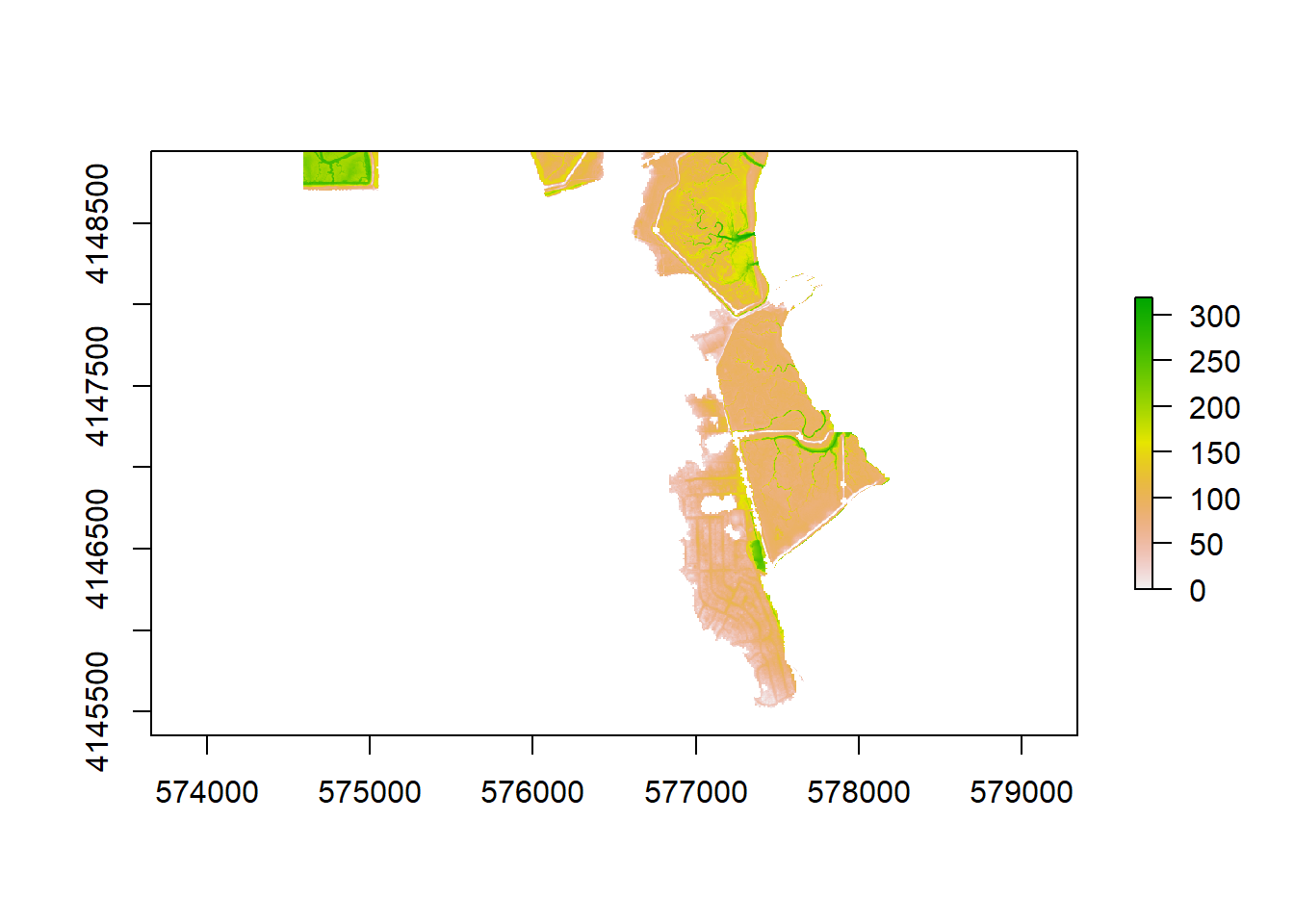
Raster files can also be loaded in using read_stars() from the stars package; a stars object has certain advantages for certain raster operations, but often needs to be converted back to a Raster object for other operations stars can’t do, including plotting in a leaflet map, as we do below with our object already in raster form, using addRasterImage() that adds onto a leaflet pipeline:
flood_pal <- colorNumeric(
palette = "Blues",
domain = values(test_flood_epa),
na.color = "transparent"
)
leaflet() %>%
addMapboxTiles(
style_id = "satellite-streets-v11",
username = "mapbox",
options = tileOptions(opacity = 0.5)
) %>%
addRasterImage(
test_flood_epa,
colors = flood_pal
) %>%
addLegend(
pal = flood_pal,
values = values(test_flood_epa),
title = "Flood depth, cm"
)To loop through the processing of multiple SLR scenarios, we can do the following:
for(slr in c("000","025","050")){
for(rp in c("001","020","100")){
print(paste0("SLR",slr,"_RP",rp))
path <- paste0("san_mateo_flooding_slr",slr,"/flooding/v2.1/county_san_mateo_flddepth_slr",slr,"_w",rp,".tif")
flood <- raster(path) %>%
crop(
epa_boundary %>%
st_transform(26910) %>%
st_bbox()
)
writeRaster(flood, paste0("flood/SLR",slr,"_RP",rp,"_epa_flood.tif"), overwrite = T)
}
}Note that for rasters, I recommend saving in TIF format using writeRaster() as shown instead of saveRDS(), which appears to not work robustly for raster files.
These 9 flood maps should now be on your local machine, and ready for further analysis. There are more severe flood maps to grab as well, but as we’ll see, their impact on risk analysis starts to become increasingly negligible, relative to the information that is already presented in the first 9, and already suggests significant risk.