4.2 Probability distributions
Let’s first play with a basic random number generator function in R to create the kinds of probability distributions we might expect in urban phenomena. If you provide runif() (which standards for “uniform”, by the way) a single number as an argument, that will be the number of random numbers generated between, by default, 0 and 1. Let’s pair this with hist() which makes a simple histogram; a histogram is doable with ggplot() too, but hist() is built into base R and is easier to quickly deploy.
library(tidyverse)

sample <- runif(1000)

hist(sample)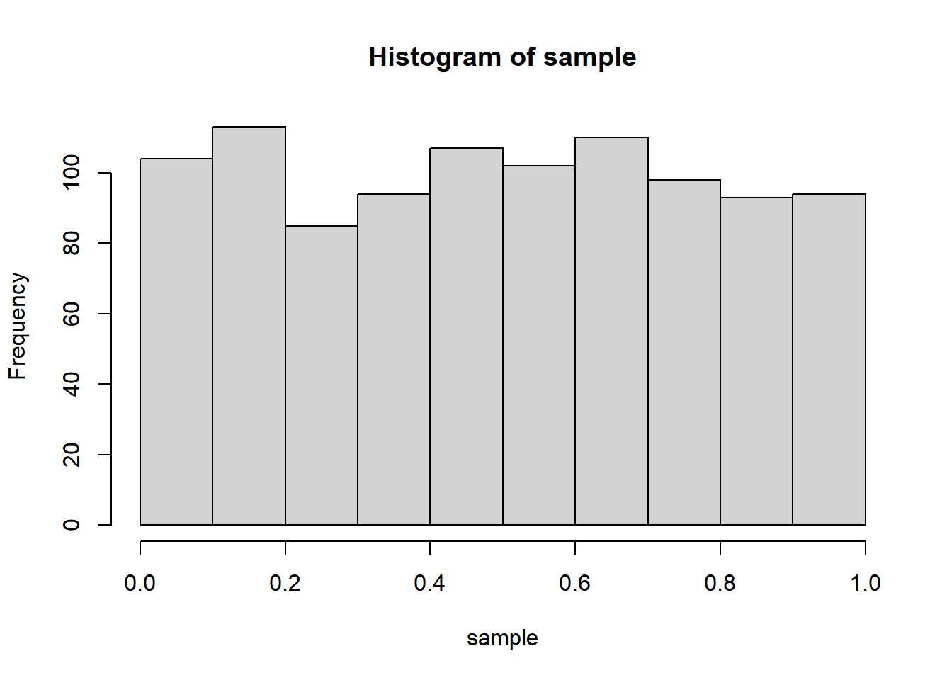
You can run this over and over again to demonstrate to yourself that the sample is constantly changing with each run, and that if you change 1000 to higher and higher numbers, the distribution gets flatter and flatter across the different automatic histogram bins (up to 20). Feel free to test the limits of your machine doing this basic kind of sampling on more and more numbers. In fact, let’s go ahead and demonstrate how to test exactly how long your machine takes to do this by wrapping the sample() line with two other lines.
start <- proc.time()
sample <- runif(10000000)
time <- proc.time() - start

time
## user system elapsed
## 0.37 0.00 0.38hist(sample)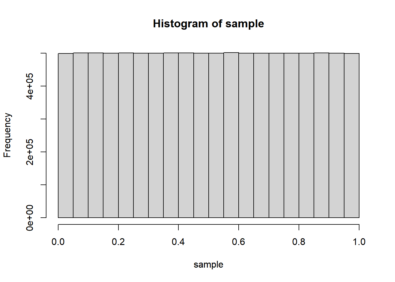
Notice that proc.time() has three named numeric values. user and system are more “machine-speak” and refer to different kinds of raw compute time that have accrued since you started your R session, while elapsed is what we would understand as seconds of experienced time. So when we run proc.time() at two different instances and get the difference, it’s the difference in elapsed that likely matters to us, and time[3] would give you that specific value. You can always use this technique to check how long any stretch of code takes; just make sure to run the code in its entirety, either the full chunk or by selecting all lines including start and time and hitting Ctrl+Enter.
Anyway, it should be clear from the histogram that runif() is a uniform distribution between 0 and 1. We can theoretically make use of this most basic of random number generators to generate any other distribution of interest. You should already know that many things in nature appear to be normally distributed instead of uniformly distributed across a range, which means the histogram would look more like a bell curve. The Galton Board is a classic device designed to demonstrate this phenomenon using a series of successive binary outcomes (moving left or right when hitting a pin) on a large population (this could, for example, approximate certain phenomena in genetics, physics, or social interactions). Let’s simulate something similar to what the Galton Board is doing, where a bunch of individuals are subject to a few rounds of random binary outcomes, where either outcome is some direction of deviation from the starting point.
We could choose to “hack” runif() so as to convert the random numbers to just two options (say, below 0.5 and above 0.5), yielding binary outcomes. Or, we can use sample() which gets the job done in a more straightforward manner; the code below yields a vector of 100 elements, each with 50% probability of being -0.5 or 0.5.
round <- sample(
  c(-0.5, 0.5),
  size = 100,
  replace = T,
  prob = c(0.5, 0.5)
)
The following chunk takes a sample of 1000000 elements and runs them through 20 rounds, in which each round subjects each element to plus or minus 0.5 (all of these numbers are arbitrary but will allow us to simulate the Galton Board). Actually, what’s happening below is that we are creating a dataframe of one million columns and 20 rows, in which each cell is either -0.5 or 0.5; these are then all summed together, as if each column were an element that implicitly started as 0 and was then subject to 20 rounds of binary outcomes. We make use of three new functions, rerun(), reduce(), and colSums(), which aren’t necessarily commonly used functions but get the job done particularly efficiently in this case. I’ll leave you to look up documentation online about these functions, as well as explore many other possible ways you could have manipulated data to produce a similar simulation.
sample <- 1000000
rounds <- 20

galton <-
  rounds %>%
  rerun(
    sample(
      c(-0.5, 0.5),
      size = sample,
      replace = T,
      prob = c(0.5, 0.5)
    )
  ) %>%
  reduce(rbind) %>%
  colSums()

hist(galton)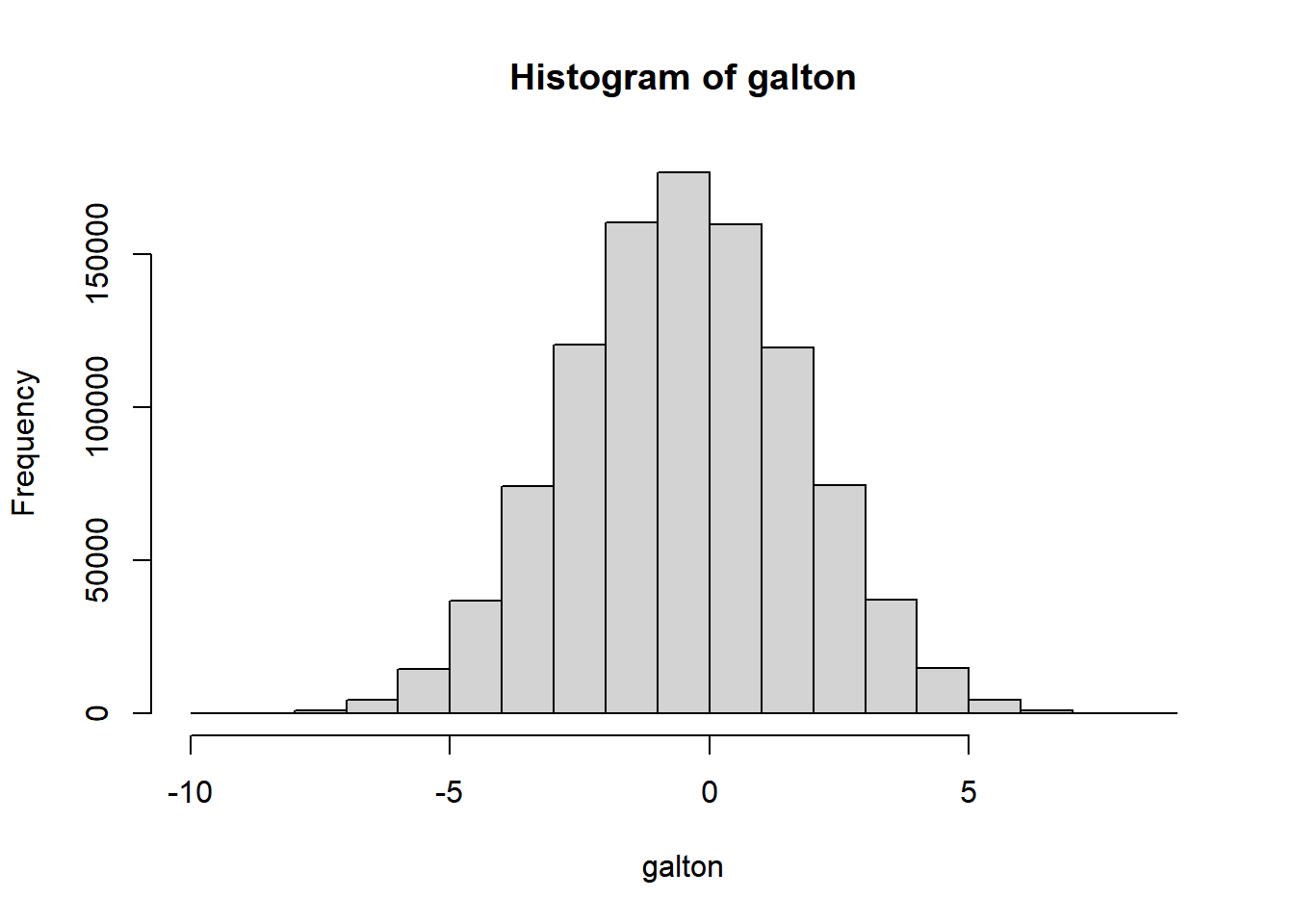
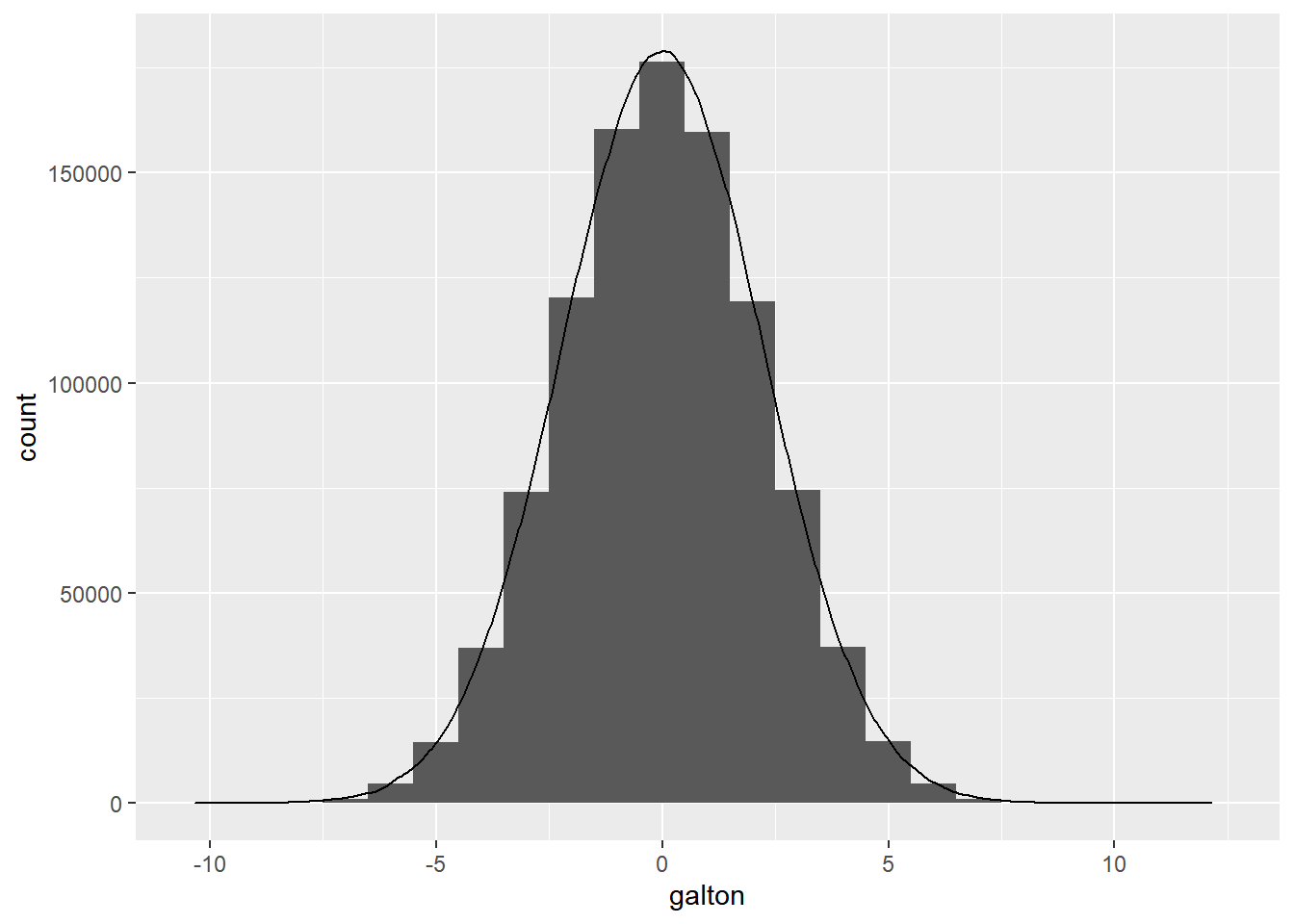
This histogram should now look familiar to you as a bell-shaped curve. A more formal exploration of the mathematics here would yield the principles of a binomial distribution, which is the specific kind of normal distribution at play here, and how the arbitrary parameters we used would relate to a more familiar concept such as standard deviation (which turns out to be the square root of 5 for our specific example). But for our purposes, let’s leave this simply as a reminder that the normal distribution can be discovered through the simplest of data experiments, and move on to using the normal distribution more directly via rnorm(), which takes as a first argument the total number of sampled outcomes desired, similar to runif(). By default it will provide samples with a mean of 0 and a standard deviation of 1. If you need a refresher on the formal mathematical definition of standard deviation, you’re encouraged to review any number of resources online. Below, we combine our Galton Board example’s histogram with our normal distribution sample, which can also be plotted as a histogram, but is plotted here instead as a density curve using geom_density().
normal_test <-
  rnorm(sample, sd = sqrt(5))

ggplot() +
  geom_histogram(
    aes(galton),
    binwidth = 1
  ) +
  geom_density(
    aes(
      normal_test,
      after_stat(count)
    )
  )