6.2 Difference-in-differences
When a treatment is applied to some units but not others, and the question of interest is whether the treatment at some specific point in time has caused a specific outcome in the following time period, it is critical to distinguish whatever change is observed in the treatment group from whatever the “counterfactual” change would have been. It is possible that whatever change you believe to be a result of the treatment is just what would have happened anyway; or, what would have happened was far in the other direction of what you observed, which implies that the impact of the treatment was even greater than it seems from the data. In any case, the actual counterfactual is unknowable, but we can assume that matched units that had a similar trend to the treated unit(s) prior to treatment are appropriate as stand-in “counterfactuals” (the exact conditions for this assumption are in large part dependent on your judgment, but can be based on the matching techniques from the last section). The “difference-in-difference”, therefore, is a measure of the difference in outcome for the treated unit(s), not only relative to the treated unit(s) pre-treatment, but also relative to the control group. We’ll be able to use the simple linear regression technique to represent the impact of the treatment via this quasi-experimental framework.
Let’s consider the impact of the new BART station, Warm Springs/South Fremont, which opened in March 2017, on the surrounding neighborhoods. In particular, we might expect that the neighborhoods just south of the BART station would have particularly increased access to the BART network overall, which might lead to more residents using BART to commute to work. If we can gather longitudinal information about commute mode before and after the “treatment” of a newly opened BART station, at a granularity that allows us to meaningfully isolate the populations likely to be affected by the treatment, then a differences-in-differences analysis would be expected to show an increase in train ridership relative to similar populations in the Bay Area that did not experience a change in train access.
Unfortunately, we are approaching the limits of what Census data can provide us, because of the trade-off between recency and geographic granularity. Our best option in this case is to use 1-year PUMS estimates. So, our first evaluation should be whether there is a PUMA that we believe is sufficiently granular to identify a particular neighborhood where we expect the “treatment” to be experienced.
library(tigris)
library(tidyverse)
library(tidycensus)
library(sf)
library(censusapi)
library(leaflet)
library(StatMatch)

Sys.setenv(CENSUS_KEY="c8aa67e4086b4b5ce3a8717f59faa9a28f611dab")

ca_pumas <-
  pumas("CA", cb = T, progress_bar = F)

bay_county_names <-
  c(
    "Alameda",
    "Contra Costa",
    "Marin",
    "Napa",
    "San Francisco",
    "San Mateo",
    "Santa Clara",
    "Solano",
    "Sonoma"
  )

bay_counties <-
  counties("CA", cb = T, progress_bar = F) %>%
  filter(NAME %in% bay_county_names)

bay_pumas <-
  ca_pumas %>%
  st_centroid() %>%
  .[bay_counties, ] %>%
  st_drop_geometry() %>%
  left_join(ca_pumas %>% select(GEOID10)) %>%
st_as_sf()leaflet() %>%
addProviderTiles(providers$CartoDB.Positron) %>%
addPolygons(
data = bay_pumas,
weight = 1,
color = "gray",
label = ~PUMACE10
) %>%
addMarkers(
lng = -121.9415017,
lat = 37.502171
) %>%
addPolygons(
data = bay_pumas %>%
filter(PUMACE10 == "08504")
)In the map above, I’ve placed a marker at the location of the Warm Springs/South Fremont BART station; this is the southernmost stop towards San Jose as of construction, and riders would take the train towards San Francisco. The PUMA boundaries, as they happen to be drawn, are not ideal for our analysis, since the neighborhoods immediately adjacent to the station are part of PUMAs that extend northward and cover regions that have existing BART stations, thereby diluting the effect of this new “treatment” on populations that previously did not have convenient access. The most promising PUMA appears, instead, to be the blue PUMA further south. This area might include residents who now find a car trip to the BART station and a transfer to BART a viable option. This also would be the PUMA that gets an even stronger treatment as of 2020, when two additional BART lines have opened within its boundaries.
Now, let’s load PUMS data of interest from the relevant years, which we’ll choose to be 2014 through 2019 so we can match this PUMA to other PUMAs based on similar trends in the three years prior to treatment, and so we can observe the potential impact of the treatment for three years. As for our outcome variable, using the official codebook, let’s focus on JWTR which is “Means of transportation to work”, where the value 4 corresponds to the ACS answer of “Subway or elevated”. The code below loads six years of PUMS data and cleans up the data before binding together (2019 data changes the name of this variable to JWTRNS).
pums_2014_2019 <-
  2014:2019 %>%
  map_dfr(function(year){

    getCensus(
      name = "acs/acs1/pums",
      vintage = year,
      region = "public use microdata area:*",
      regionin = "state:06",
      vars = c(
        "SERIALNO",
        "SPORDER",
        ifelse(
          year == 2019,
          "JWTRNS",
          "JWTR"
        ),
        "PWGTP",
        paste0("PWGTP",1:80)
      )
    ) %>%
      mutate(
        year = year,
        PUMA = public_use_microdata_area %>% str_pad(5,"left","0")
      ) %>%
      filter(
        PUMA %in% bay_pumas$PUMACE10
      ) %>%
      rename(
        JWTR = ifelse(
          year == 2019,
          "JWTRNS",
          "JWTR"
        )
      )

  })

pums_bart <- pums_2014_2019 %>%
  mutate(
    PWGTP = as.numeric(PWGTP),
    bart = ifelse(
      JWTR %in% c("4"),
      PWGTP,
      0
    )
  ) %>%
  group_by(PUMA, year) %>%
  summarize(
    pop = sum(PWGTP),
    bart = sum(bart)
  )
Before moving on, let’s look at the distribution of population and BART commuters in the Bay Area PUMAs, which might give further insights to how best to construct the difference-in-differences analysis. We’ll arbitrarily pick 2017 to view one slice of time.
pums_pal <- colorNumeric(
  palette = "YlOrRd",
  domain = pums_bart %>%
    filter(year == 2017) %>%
    pull(pop)
)

leaflet() %>%
  addProviderTiles(providers$CartoDB.Positron) %>%
  addPolygons(
    data = pums_bart %>%
      filter(year == 2017) %>%
      right_join(bay_pumas %>% select(PUMA = PUMACE10)) %>%
      st_as_sf(),
    fillColor = ~pums_pal(pop),
    color = "white",
    weight = 1,
    fillOpacity = 0.5,
    label = ~paste0(PUMA,": Population ", pop)
  )
pums_pal <- colorNumeric(
palette = "GnBu",
domain = pums_bart %>%
filter(year == 2017) %>%
pull(bart)
)
leaflet() %>%
addProviderTiles(providers$CartoDB.Positron) %>%
addPolygons(
data = pums_bart %>%
filter(year == 2017) %>%
right_join(bay_pumas %>% select(PUMA = PUMACE10)) %>%
st_as_sf(),
fillColor = ~pums_pal(bart),
color = "white",
weight = 1,
fillOpacity = 0.5,
label = ~paste0(PUMA,": ", bart, " BART commute riders")
)The percentages of BART commute ridership look like they would be near zero in the South Bay no matter the year, so it may be better to observe the possible effect on absolute BART commuters instead of percent BART commuters.
Now, let’s further manipulate this data so that, for each PUMA, the different years of available data are in wide format.
pums_bart_clean <-
  pums_bart %>%
  select(-pop) %>%
  pivot_wider(
    names_from = year,
    values_from = bart
  )
Now, we can apply the Mahalanobis matching technique from the previous section to PUMAs in the Bay Area, using the 2014-2016 bart values, and finding matches to our selected PUMA:
obs_matrix <-
  pums_bart_clean %>%
  ungroup() %>%
  select(`2014`,`2015`,`2016`) %>%
  as.matrix()

dist_matrix <- mahalanobis.dist(obs_matrix)

rownames(dist_matrix) <- pums_bart_clean$PUMA
colnames(dist_matrix) <- pums_bart_clean$PUMA

match <- dist_matrix["08504",] %>%
  as.data.frame() %>%
  rownames_to_column() %>%
  rename(
    PUMA = rowname,
    match = "."
  ) %>%
  right_join(
    pums_bart_clean
  ) %>%
  arrange(match) %>%
  .[1:11, ] %>%
  left_join(bay_pumas %>% select(PUMA = PUMACE10)) %>%
st_as_sf()leaflet() %>%
addTiles() %>%
addProviderTiles(providers$CartoDB.Positron) %>%
addPolygons(
data = match[1, ],
color = "red",
label = ~PUMA
) %>%
addPolygons(
data = match[-1, ],
label = ~PUMA
)At first glance, these PUMAs seem to be appropriate matches at least in the sense that none of them are adjacent to existing BART stations at the time of observation. Now, let’s visually inspect what the longitudinal results look like, comparing our treatment PUMA to the average of the ten matched PUMAs:
match_pumas <-
  match %>%
  filter(!PUMA %in% c("08504")) %>%
  st_drop_geometry() %>%
  select(-match) %>%
  pivot_longer(
    -PUMA,
    names_to = "year",
    values_to = "bart"
  ) %>%
  group_by(
    year
  ) %>%
  summarize(
    bart = mean(bart),
    PUMA = "Similar PUMAs"
  )

treatment_pumas <-
  match %>%
  filter(PUMA %in% c("08504")) %>%
  select(-match) %>%
  st_drop_geometry() %>%
  pivot_longer(
    -PUMA,
    names_to = "year",
    values_to = "bart"
  )

rbind(
  treatment_pumas,
  match_pumas
) %>%
  ggplot(
    aes(
      x = as.numeric(year),
      y = bart,
      color = PUMA
    )
  ) +
  geom_line() +
  geom_vline(xintercept = 2017, linetype = "dashed") +
  labs(
    title = "Milpitas vs. control neighborhoods, BART ridership",
    x = "Year",
    y = "BART commute riders"
  )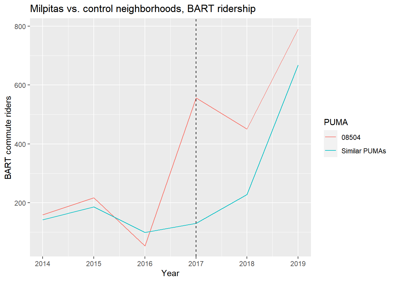
Based on just the graph, it may seem clear that the selected PUMA has an increase in BART ridership relative to the control PUMAs, but given the scale of that difference and the averaging of the behavior of the control PUMAs (keep in mind we’re artificially viewing one teal line when in fact there are ten with possibly wide variation), we should withhold judgment until we see the results of the formal difference-in-differences analysis, using lm(). (For purposes of simplification, we will not apply the survey regression correction from Chapter 5.4, though you are encouraged to make use of replicate weights in your own analysis.)
Let’s first create a tidy version of the data for our treatment and control PUMAs, then create coded variables time and treated which identify year 2017-2019 and the records pertaining to our Milpitas PUMA. Then, to simulate a difference-in-differences regression, simply include treated*time on the right side of the ~ in lm(), which is an interaction between the treatment unit and the time of treatment.
transit_did <-
  match %>%
  st_drop_geometry() %>%
  select(-match) %>%
  pivot_longer(
    -PUMA,
    names_to = "year",
    values_to = "bart"
  ) %>%
  mutate(
    year = year %>% as.numeric(),
    time = ifelse(year >= 2017, 1, 0),
    treated = ifelse(PUMA == "08504", 1, 0)
  )

did_reg <- lm(bart ~ treated*time, data = transit_did)

summary(did_reg)
##
## Call:
## lm(formula = bart ~ treated * time, data = transit_did)
##
## Residuals:
## Min 1Q Median 3Q Max
## -341.97 -164.97 -142.37 65.76 1536.03
##
## Coefficients:
## Estimate Std. Error t value Pr(>|t|)
## (Intercept) 142.3667 71.1396 2.001 0.0497 *
## treated 0.9667 235.9434 0.004 0.9967
## time 199.6000 100.6066 1.984 0.0517 .
## treated:time 256.0667 333.6743 0.767 0.4457
## ---
## Signif. codes: 0 '***' 0.001 '**' 0.01 '*' 0.05 '.' 0.1 ' ' 1
##
## Residual standard error: 389.6 on 62 degrees of freedom
## Multiple R-squared: 0.09602, Adjusted R-squared: 0.05228
## F-statistic: 2.195 on 3 and 62 DF, p-value: 0.09754Notice in the summary output a new coefficient row, treated:time. This happens to be the “difference-in-differences” result of interest, in the sense that we’d describe the treatment, the Milpitas BART station in 2017, as having had an estimated impact of about 250 new BART commuters. However, despite the positive effect size of the treatment and the previous plot, the result doesn’t appear to be statistically significant (i.e. p-value is not less than 5%), so one should not jump to any conclusion with just this analysis. The other terms describe “baseline” effects: treated represents the pre-treatment difference between treatment and control PUMAs (viewable in the previous line graph as the average vertical difference between the two lines before 2017), and time represents the change in the control PUMAs from pre-treatment to post-treatment. These are “controlled for”, in the sense that our actual effect of interest, treated:time, only focuses on the difference beyond these baseline differences.
Keep in mind all the various arbitrary choices and assumptions that went into this analysis, such as:
- We chose a particular outcome to evaluate,
bart, which may not be the most pronounced or important possible causal effect of a BART station to evaluate. Perhaps the key ridership is arriving at the Warm Springs station, not leaving from it (which would not be observable using the same kind of PUMS analysis). Perhaps the greater impact of a station is on commercial and residential development. Perhaps ridership has increased, but just not as the travel mode for work trips. That being said, commute ridership would seem to be a very straightforward measure of the impact of a BART station in a community. - We are assuming that respondents picked “Subway or elevated car” in the ACS questionnaire to represent a BART commute trip.
- The BART station opened in Spring 2017, and PUMS responses could have been sampled from earlier in the year. We chose specifically to include 3 years of post-treatment instead of 1, but couldn’t choose more than 3 because of the data available. Perhaps the effect is more pronounced with additional years, but additional years can cause control PUMAs to no longer be appropriate given their own exposure to similar kinds of treatments (like the Antioch BART station, which might be diluting our DiD estimate for Milpitas since one of our matched PUMAs is in the catchment area of Antioch BART).
- We did not have the cleanest geographies to choose from, so the particular PUMA we chose to consider as “treated” may have been too big to see the relevant effect, which may have been mainly on neighborhoods within biking/walking distance of the station. On the other hand, we may not have picked enough PUMAs, if most riders are driving in from further away.
- We chose 10 matching PUMAs using Mahalanobis distance, but this could have been fewer or more PUMAs.
- We did not match based on any other variables other than 2014-2016 train ridership. For example, we could have “controlled for” other variables like employment, income, demographics, in the same way we would have done a multiple regression.
- We are using PUMS data which may introduce greater noise because of lower sample size relative to other possible datasets. In this example we did not incorporate replicate weights for simplicity; if you were to include them, you’d get a lower standard error on
treated:time, making this result almost statistically significant.
Difference-in-differences analysis, like all quasi-experimental designs, fundamentally depend on a lot of user judgment to construct, which opens up the danger of one simply adjusting the model assumptions until one finds a significant result. In this case, no matter which way you cut it, the possible analyses here of the effect of the Warm Springs station on nearby BART ridership don’t seem to support rejecting the null hypothesis. Besides demonstrating how to construct a difference-in-differences analysis, hopefully this analysis demonstrates that one should be perfectly satisfied with the possibility that the causal effects you’re looking for simply aren’t there.