4.1 Equity analysis
What we mean by “equity analysis” is the visualization and quantification of disproportionate outcomes across population groups of interest. Without diving deeply into the ethics that might motivate such an analysis, I’ll just assume that, with the examples shown in this section, you will agree that these ways of looking at population data are meaningful for understanding some kind of problem we might want to solve in society (however difficult the solutions may actually be).
The simplest version of this type of analysis involves only ACS summary data as we’ve used in Chapter 2, but requires that the specific dataset loaded has an “outcome of interest”, broken into some number of buckets or tiers, and “population groups of interest”, with which we can count membership in those outcome buckets. For demonstration, we’ll use a well-established example, income vs. race. Income is acting here as the “outcome of interest”, which is to say that if we break up income into different tiers, generally, everyone would agree that it’s a better outcome for a household to be in higher income tiers. Racial groups are acting here as the “population groups of interest”, because if we discover that different racial groups have different outcomes in household income, generally, many people would consider that social arrangement to be worse than a world in which there were no differences in income distribution. Put another way, if you buy into the idea that we can’t choose our individual races when we are born into this world and can’t choose what household we grow up in, and you agree that therefore we should set up society so that everybody at least has an equal opportunity to thrive in life, then finding disproportionate household income by racial groups would be a clear signal of systems work to be done. Of course this topic is fraught with political controversy, but for our purposes, we are simply focusing on how to create objective measures that can be used to support the process of deliberation in urban governance. Let me further stress that we’re basically going to be doing a specific kind of math on a two-dimensional disaggregation of a population sample, but just applying it to any “X by Y” breakdown of a population doesn’t necessarily yield a “meaningful” result from an ethical perspective; so you’ll need to think carefully about the point you are trying to communicate, and whether it makes sense to conduct this kind of analysis.
Let’s go ahead and try to find the relevant dataset in the ACS database. A quick search online would point you to a long list of datasets that all appear to provide some combination of income and race information. Here, some amount of experience with the ACS universe is key; I’ll go ahead and point you to the B19001 series as the most useful datasets, specifically B19001A through B19001G for the different key racial groups recorded by the Census Bureau (you’ll find it often the case that different racial groups are given their entire own datasets, given the importance of data about race). However, this presents an extra processing step of having to load in data from multiple “datasets” (i.e. different getCensus() calls) and merging them together. No matter what, you are likely to need to do some data wrangling to get your data ready for a structured equity analysis, so this will be a good example to demonstrate, and you might find that your own chosen pairing is easier (or harder) to orchestrate.
If you don’t already have this ready to go, make sure to have censusapi loaded, the Census API key set, and the acs_vars_2019_5yr data dictionary loaded (from online or from your stored location):
library(tidyverse)
library(censusapi)

Sys.setenv(CENSUS_KEY="c8aa67e4086b4b5ce3a8717f59faa9a28f611dab")

acs_vars_2019_5yr <-
  listCensusMetadata(
    name = "2019/acs/acs5",
    type = "variables"
  )
As a first test, let’s just load B19001A, which is just household income for households led by somebody who is “White alone”.
bay_income_white <-
  getCensus(
    name = "acs/acs5",
    vintage = 2019,
    region = "county:001,013,041,055,075,081,085,095,097",
    regionin = "state:06",
    vars = "group(B19001A)"
  ) %>%
  select(!c(GEO_ID,state,NAME) & !ends_with(c("EA","MA","M"))) %>%
  pivot_longer(
    ends_with("E"),
    names_to = "name",
    values_to = "estimate"
  ) %>%
  left_join(
    acs_vars_2019_5yr %>%
      select(name, label)
  ) %>%
  select(-name) %>%
  separate(
    label,
    into = c(NA,NA,"income"),
    sep = "!!"
  ) %>%
  filter(!is.na(income))
Note that this is very similar to what we’ve done before, but choosing counties as the unit of data, our region = argument can include a list of all 9 Bay Area counties by their FIPS codes, and some of the data manipulation changes because of the different fields of data involved.
Conceptually, all we need to do to combine all 7 datasets together is to load them individually like this, use mutate() to add a race field and manually enter the appropriate racial group label, and then bind them together. Since we have done a test run, we should be able to quickly set up a map_dfr() loop (which we first encountered in Chapter 2.1) without experiencing many errors; otherwise, you should always feel comfortable using for loops for simple processes like this.
Let’s first create a simple lookup table that we can use to help with looping and supplying the race label to the mutate() step. You can always create a quick new dataframe as such using data.frame(). Keep this in mind as a generalizable technique. The racial categories come directly from the ACS questionnaire options.
census_race_categories <- data.frame(
  code = c("A","B","C","D","E","F","G"),
  category =
    c(
      "White Alone",
      "Black or African American",
      "American Indian and Alaska Native Alone",
      "Asian Alone",
      "Native Hawaiian and Other Pacific Islander Alone",
      "Some Other Race Alone",
      "Two or More Races"
    )
)
We’re basically just setting up a relationship between the letter codes and the race labels that we can use in a number of ways. Also note that you could replicate the list of letters using the built-in R object LETTERS, like LETTERS[1:7]. In fact, since the codes are so straightforward, we can simplify the process further, as shown below:
census_race_categories <-
  c(
    "White Alone",
    "Black or African American",
    "American Indian and Alaska Native Alone",
    "Asian Alone",
    "Native Hawaiian and Other Pacific Islander Alone",
    "Some Other Race Alone",
    "Two or More Races"
  )

bay_income_race <-
  1:7 %>%
  map_dfr(function(x){
    getCensus(
      name = "acs/acs5",
      vintage = 2019,
      region = "county:001,013,041,055,075,081,085,095,097",
      regionin = "state:06",
      vars = paste0("group(B19001",LETTERS[x],")")
    ) %>%
      select(!c(GEO_ID,state,NAME) & !ends_with(c("EA","MA","M"))) %>%
      pivot_longer(
        ends_with("E"),
        names_to = "name",
        values_to = "estimate"
      ) %>%
      left_join(
        acs_vars_2019_5yr %>%
          select(name, label)
      ) %>%
      select(-name) %>%
      separate(
        label,
        into = c(NA,NA,"income"),
        sep = "!!"
      ) %>%
      filter(!is.na(income)) %>%
      mutate(race = census_race_categories[x])
  })
Notes:
census_race_categorieshas changed from a dataframe to just a vector of 7 strings. However, keep in mind the dataframe approach for more generalizable look-up tables.- We’re just feeding the vector of integers
1:7intofunction(x)because we can easily refer toLETTERS[x]when necessary to get A through G. See howpaste0()is used here to construct the appropriate ACS variable code. - The only other change is the addition of the
mutate()at the end, where now we can refer tocensus_race_categories[x]to get the appropriate racial label, as long as we’ve ensured that the order is correct.
Now we are ready to conduct the equity analysis. Note that the last step was unique to our situation involving racial data because it happens to be organized in the ACS database in this specific way, with the A through G codes. For a different initial pairing of “outcome” and “population group”, you might be able to load just one ACS variable code, similar to our test of household income for White alone households, and be immediately at this step. What matters is that at this point you should have a tidy dataset with an “outcome” field (here filled with the 16 income tiers the ACS provides us), a “population group” field (here filled with our 7 racial labels), and a “count” field with the counts of individuals or households in each of these “buckets”. You can optionally also have a “geography” field (here filled with the 9 counties; we’ll aggregate the data to just get Bay Area-wide insights, but you could also get equity insights for each individual county and compare equity outcomes across counties).
The simplest form of equity analysis is simply plotting this data in a way that clearly visualizes disproportionate outcomes across the different population groups. My preference is to show stacked bar charts, both absolute and percentage-based, that show the distribution of the population groups (in this case, race) for the total population of the geographic region (e.g., the whole Bay Area, but you could filter your current dataset to one individual county at a time), followed by bars for each individual outcome tier (in this case income). Let’s get to our desired visualization in a series of attempts, using ggplot.
bay_income_race %>%
  group_by(income, race) %>%
  summarize(estimate = sum(estimate)) %>%
  ggplot() +
  geom_bar(
    aes(
      x = income,
      y = estimate,
      fill = race
    ),
    stat = "identity",
    position = "stack"
  ) +
  labs(
    x = "Household income",
    y = "Number of households",
    title = "Bay Area household income by race",
    fill = "Race of householder"
  )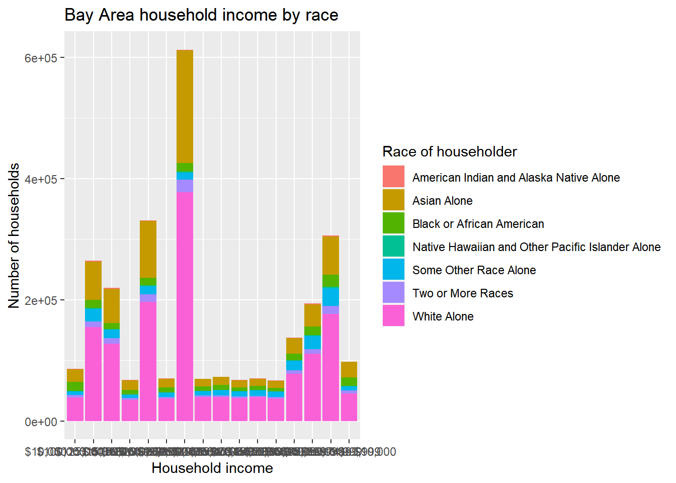
This is sort of a hot mess because the income labels are all jumbled together. The easy solution will be to add + coord_flip() to the operation (if you didn’t know, you’d find out with a quick Google search).
bay_income_race %>%
  group_by(income, race) %>%
  summarize(estimate = sum(estimate)) %>%
  ggplot() +
  geom_bar(
    aes(
      x = income,
      y = estimate,
      fill = race
    ),
    stat = "identity",
    position = "stack"
  ) +
  labs(
    x = "Household income",
    y = "Number of households",
    title = "Bay Area household income by race",
    fill = "Race of householder"
  ) +
  coord_flip()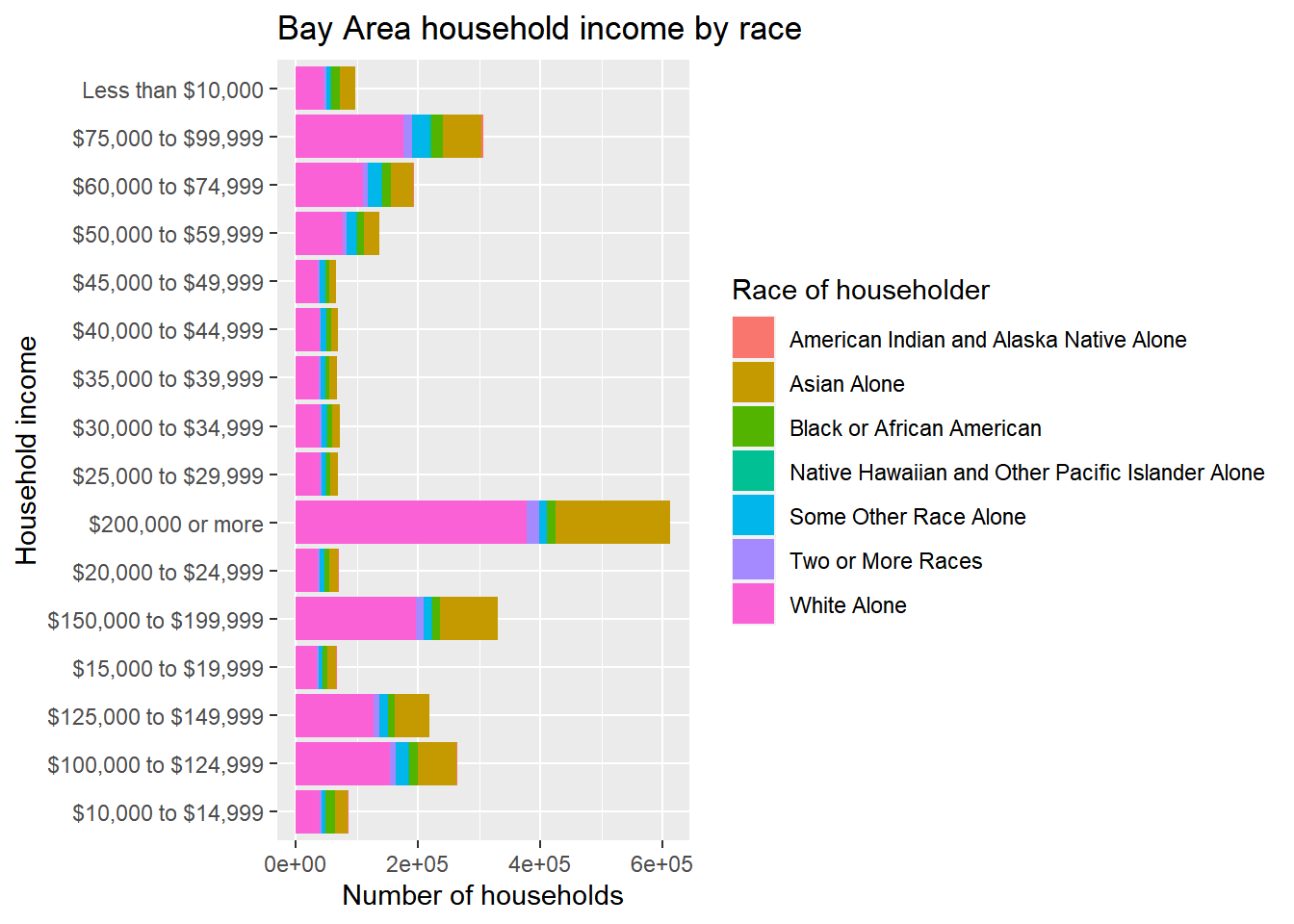
Now we can also notice a problem with the order of the income tiers. ggplot appears to have ordered the string labels alphabetically, but what we want is the existing order from the ACS data which would be captured in bay_income_race$income[1:16] or unique(bay_income_race$income), which you can try in the Console to confirm. The appropriate technique is to pipe to factor(), which you can think of as a character class that can remember a specific non-alphabetical ordering. Specify levels = as an argument, in which you provide a string with all the factor candidates in the order you’d like. I’ll add this fix below, for both income and race.
bay_income_race %>%
  group_by(income, race) %>%
  summarize(estimate = sum(estimate)) %>%
  ggplot() +
  geom_bar(
    aes(
      x = income %>% factor(levels = unique(bay_income_race$income)),
      y = estimate,
      fill = race %>% factor(levels = unique(bay_income_race$race))
    ),
    stat = "identity",
    position = "stack"
  ) +
  labs(
    x = "Household income",
    y = "Number of households",
    title = "Bay Area household income by race",
    fill = "Race of householder"
  ) +
  coord_flip()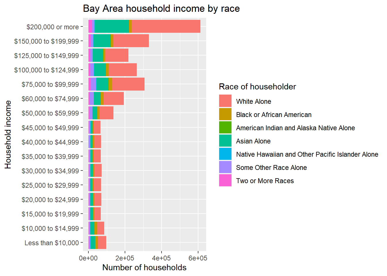
This is now looking pretty good, but there may be additional aesthetic preferences. Particularly, while these “absolute” bar heights may helpfully show the relative difference in numbers of households in each of the income tiers, to get at a distributional issue within the tiers, we need to be able to better see the smaller bars, so position = “fill” instead of position = “stack” will address that (make sure to change the axis label accordingly). At the same time, let’s also reverse the order of the income tiers, just because we might prefer to have “Less than $10,000” at the top, and it’s good to know how to do this with rev(). Lastly, let’s move the legend to the bottom so there’s more room to see the bars, and reorder it, using some arguments in theme() and guides().
bay_income_race %>%
  group_by(income, race) %>%
  summarize(estimate = sum(estimate)) %>%
  ggplot() +
  geom_bar(
    aes(
      x = income %>% factor(levels = rev(unique(bay_income_race$income))),
      y = estimate,
      fill = race %>% factor(levels = rev(unique(bay_income_race$race)))
    ),
    stat = "identity",
    position = "fill"
  ) +
  labs(
    x = "Household income",
    y = "Proportion of households",
    title = "Bay Area household income by race",
    fill = "Race of householder"
  ) +
  coord_flip() +
  theme(
    legend.position = "bottom",
    legend.direction = "vertical"
  )  +
  guides(
    fill = guide_legend(
      reverse = T
    )
  )
You might consider this “done”, but as I noted earlier, I like to add a bar at the very top representing the “total” population, not broken up into income tiers, which had originally existed at the getCensus() step but we had removed, so that can be manually added to the initial dataset as shown below:
bay_race_total <-
  bay_income_race %>%
  group_by(race) %>%
  summarize(estimate = sum(estimate)) %>%
  mutate(income = "Total")

bay_income_race %>%
  group_by(income, race) %>%
  summarize(estimate = sum(estimate)) %>%
  rbind(bay_race_total) %>%
  ggplot() +
  geom_bar(
    aes(
      x = income %>% factor(levels = rev(c("Total",unique(bay_income_race$income)))),
      y = estimate,
      fill = race %>% factor(levels = rev(unique(bay_income_race$race)))
    ),
    stat = "identity",
    position = "fill"
  ) +
  labs(
    x = "Household income",
    y = "Proportion of households",
    title = "Bay Area household income by race",
    fill = "Race of householder"
  ) +
  coord_flip() +
  theme(
    legend.position = "bottom",
    legend.direction = "vertical"
  )  +
  guides(
    fill = guide_legend(
      reverse = T
    )
  )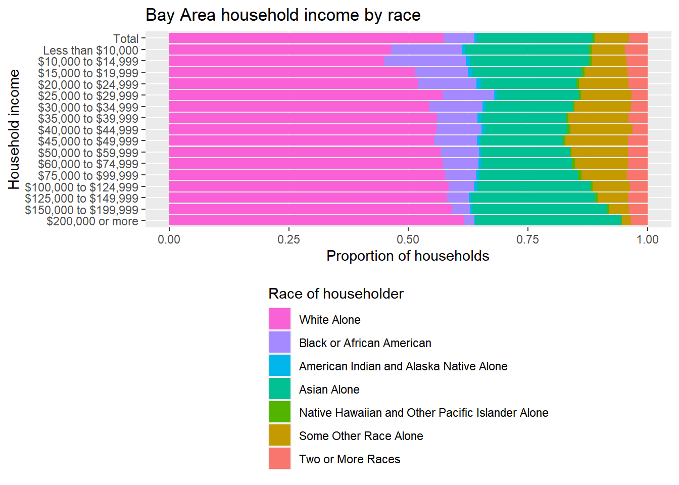
Ultimately, all I’ve shown is a specific visual design technique to communicate an underlying equity issue that one might want to address. The specific content choices are, of course, entirely up to you. Besides the charts, generally you might find it useful to communicate specific numbers from the chart in the following way: “The overall population in the Bay Area is 43% non-White, but the subpopulation of households making less than $30,000 (roughly what would be considered extremely low income in the Bay Area) is 50% non-White. If income were “race-blind”, these percentages would be the same, but instead, non-White households appear to be 18% more likely to be extremely low income than we’d expect.”
The numbers above would be the kinds of specific numbers you pull directly from the data, as shown below, examples of an infinite number of ways you could manipulate the tabular data to get these numbers:
((sum(bay_race_total$estimate[1:6])/sum(bay_race_total$estimate))*100) %>% round()## [1] 43((bay_income_race %>%
filter(income %in% bay_income_race$income[1:5]) %>%
filter(race != "White Alone") %>%
pull(estimate) %>%
sum()) /
(bay_income_race %>%
filter(income %in% bay_income_race$income[1:5]) %>%
pull(estimate) %>%
sum()) * 100) %>%
round()## [1] 50((((bay_income_race %>%
filter(income %in% bay_income_race$income[1:5]) %>%
filter(race != "White Alone") %>%
pull(estimate) %>%
sum()) /
(bay_income_race %>%
filter(income %in% bay_income_race$income[1:5]) %>%
pull(estimate) %>%
sum())) / (sum(bay_race_total$estimate[1:6])/sum(bay_race_total$estimate)) - 1) * 100) %>%
round()## [1] 18If the above is difficult to parse, consider this a good opportunity to practice using the R techniques to produce the same numbers another way. pull(), by the way, is just a dplyr way of grabbing one field from a dataframe similar to how you’d use the $ sign. Also note that the numbers I showed in the quote above were actually directly generated using the same code as inline code, similar to how I introduced the Sys.Date() trick in the YAML introduction.
Equity analyses can also be constructed out of CBG-level information, in which the relevant bucketed information (e.g. income by race) at the CBG level is aggregated up by group_by() and summarize() to the desired overall geographic region of interest, at which point the same visualizations and math can be performed. If the ACS provides you the information you’re looking for both at the CBG level and at the larger geographic scale you’re interested in (like our previous County and Bay Area example), then there’s no reason to work with CBG level data. But if you need to construct your own geographic region of interest that isn’t an official Census geography, then you’d want to start work with the most granular data available and then build up to your desired region of interest. You may also have “outcome” information that isn’t available in Census geographies to begin with (and doesn’t otherwise have any population data associated with it), in which case you would first need to join your outcome data to some kind of population information, and CBGs would be the best option in order to match differentiated outcomes to differentiated populations in the most granular way possible; then, you can use that information for a broader equity analysis.
As a partial example of this more circuitous approach, let’s consider CalEnviroScreen, which is a product of the California Office of Environmental Health Hazard Assessment and California Environmental Protection Agency, meant essentially to assess disproportionate environmental outcomes for California communities. This report in fact includes the kinds of equity analysis visualizations we’ve covered in this section (see Figure 2, 3). We can download the CalEnviroScreen data and replicate this type of analysis for a more specific measure within its index, such as PM2.5. Note that this is a dataset that provides us with “outcome” data (in this case, air pollution) already processed to the census tract level, which means we don’t have to do one processing step that I described in the last paragraph of converting outcome data in some other kind of geographic form to Census geographies. In this case, we benefit from OEHHA doing that work for us (e.g. converting point-based air quality station sensor data, though we’ll do this ourselves in a later chapter). So let’s go ahead and see what that air pollution data looks like for census tracts in the Bay Area, and then decide how to proceed from there to an equity analysis.
The main web page provides a few different ways to download the data. Let’s go ahead and use this as an opportunity to try reading zip files with Excel spreadsheets, such as the CalEnviroScreen 4.0 Excel and Data Dictionary PDF link, using readxl, which is similar to readr and also in the tidyverse but not automatically loaded when you load library(tidyverse), meaning you’ll need to load it individually. Otherwise, we use the tempfile approach we first used in Chapter 3.1.
library(readxl)

temp <- tempfile()
download.file("https://oehha.ca.gov/media/downloads/calenviroscreen/document/calenviroscreen40resultsdatadictionaryf2021.zip",destfile = temp)

ces4 <- read_excel(
  unzip(
    temp,
    "calenviroscreen40resultsdatadictionary_F_2021.xlsx"
  ),
  sheet = "CES4.0FINAL_results"
)

unlink(temp)
Notes:
- This specific
unzip()technique only works on PCs. If you are using a Mac, you can manually download the Excel file and then read usingread_excel(). - If you don’t specify the
sheet =argument inread_excel(), it will default load the first sheet in the Excel file. Of course, you don’t necessarily know in advance what the contents of the Excel sheet are; you could useexcel_sheets()on the file to view the sheet names. - Keep in mind that Excel sheets can be formatted in strange ways, so be prepared for strange results when trying to read from them. This is why we generally prefer simple CSVs that are more likely to be “just data” and not a “formatted document of data”.
- Remember to pair
temp <- tempfile()withunlink(temp)so your temporary folder and its contents are removed.
ces4 now contains a lot of information at the census tract level. The online documentation indicates that the PM2.5 field is “Annual mean concentration of PM2.5 (weighted average of measured monitor concentrations and satellite observations, µg/m3), over three years (2015 to 2017)”. Furthermore, the documentation notes: “In 2020, US EPA made the decision to retain the 2012 standard for ambient PM2.5 concentration of 12 µg/m3 (US EPA, 2020).” Let’s use that field as our “outcome” and create our outcome tiers based on the distribution of outcomes we see in the Bay Area.
bay_county_names <-
  c(
    "Alameda",
    "Contra Costa",
    "Marin",
    "Napa",
    "San Francisco",
    "San Mateo",
    "Santa Clara",
    "Solano",
    "Sonoma"
  )

ca_tracts <- tracts("CA", cb = T, progress_bar = F)

ces4_bay_pm25 <-
  ces4 %>%
  filter(`California County` %in% bay_county_names) %>%
  select(`Census Tract`, PM2.5) %>%
  left_join(
    ca_tracts %>%
      transmute(GEOID = as.numeric(GEOID)),
    by = c("Census Tract" = "GEOID")
  ) %>%
  st_as_sf()
pm25_pal <- colorNumeric(
palette = "Reds",
domain = ces4_bay_pm25$PM2.5
)
leaflet() %>%
addProviderTiles(providers$CartoDB.Positron) %>%
addPolygons(
data = ces4_bay_pm25,
fillColor = ~pm25_pal(PM2.5),
color = "white",
weight = 0.5,
fillOpacity = 0.5,
label = ~PM2.5
)Notes:
California CountyandCensus Tractare written with backticks because of the space in the variable name, which generally is how you deal with special variable names indplyrfunctions, though it’s not always obvious when you use backticks and when you use quotation marks; that just comes with experience.- When working with new data, make sure to check for NAs. The easiest way to do this is with something like
sum(is.na(ces4_bay_pm25$PM2.5))in the Console. And if you need to remove NAs, the easiest method isfilter(!is.na(PM2.5))in the pipeline. - The
GEOIDfield in thetigrisdatasetca_tractscomes as a character type field with a “0” in front of the codes, which won’t join with theCensus Tractfield inces3which is a numeric type field. In this case, the easier way to align types is to convert the character field to a numeric field, by which it will know to automatically drop the leading zero.transmute()is amutate()that also only keeps what is mutated, so it’s like amutate()+select()(with the caveat that asfobject will still keep itsgeometryfield, which is good for us in this case).
Let’s quickly see what the minimum and maximum PM2.5 values recorded by CalEnviroScreen are in the Bay Area:
summary(ces4_bay_pm25$PM2.5)## Min. 1st Qu. Median Mean 3rd Qu. Max.
## 5.500 8.262 8.564 8.480 8.748 10.522Now, the key assumption we have to make, if we want to do the kind of equity analysis we did, is that this “outcome” affects everybody in a given census tract the same way. Essentially, if our population grouping of interest is again race, we are assuming that the outcome is “race-blind” at the census tract level, but then when aggregating up to the entire Bay Area, we may find that being of a given race appears to be associated with better or worse air quality on average. Keep in mind that this assumption may very well be incorrect depending on the outcome, and it could be incorrect in a direction that would mean even greater inequity. But let’s go ahead and see where that assumption takes us for this example. For a given census tract, we’ll now look up population counts in racial groups, and append this outcome data directly to all buckets within a census tract, then recreate the regional tidy dataframe we need to perform the equity analysis.
census_race_categories <-
  c(
    "White Alone",
    "Black or African American",
    "American Indian and Alaska Native Alone",
    "Asian Alone",
    "Native Hawaiian and Other Pacific Islander Alone",
    "Some Other Race Alone",
    "Two or More Races"
  )

bay_race_tracts <-
  1:7 %>%
  map_dfr(function(x){
    getCensus(
      name = "acs/acs5",
      vintage = 2019,
      region = "tract:*",
      regionin = "state:06+county:001,013,041,055,075,081,085,095,097",
      vars = paste0("B19001",LETTERS[x],"_001E")
    ) %>%
      mutate(
        tract = paste0(state, county, tract) %>% as.numeric(),
        race = census_race_categories[x]
      ) %>%
      select(
        tract,
        race,
        estimate = paste0("B19001",LETTERS[x],"_001E")
      )
  })
Notes:
- This loop is very similar to what we did for the income by race equity analysis, but since we need tract level data instead of county level data, note the different structure of the arguments
region=andregionin=, based on whatgetCensus()is designed to let you specify. The asterisk intract:*specifically means “all tracts in”. - Keep in mind that when you’re trying something for the first time that you might eventually want to loop, it’s always helpful to do a test with just one dataset first. I’m not showing that testing here, but it’d be something you do directly in your Source document as you are developing your code.
- In this case, since we just need total counts by race in each tract, we don’t need all the pivoting steps we’ve done before, and can simply select the first field of data (e.g.
B19001A_001E) based on our experience with this kind of ACS dataset and knowing that this field contains the total count (of a racial group). Notice how thevars=argument, instead of specifying agroup(), grabs just a single variable directly, in this case the_001Efield from the given dataset. - Notice the
mutate()added to recreate thetractfield as apaste0()ofstate,county, andtractwhen working with tract data, since the ACS API doesn’t give you the most useful form of the tract ID directly. We are also converting the tract ID to a numeric. You might not know to do this in advance, but as soon as you get to a step in which you need to join tract IDs, say with our PM2.5 data, you’d realize that you need to fix something upstream in your process. This kind of foresight just takes looking closely at any new data you encounter, and learning with trial and error. - Also notice how within a
select(), you can rename fields that you choose to select.
Now, we join the PM2.5 data to this dataframe and then group_by() and summarize():
bay_pm25_race <-
  bay_race_tracts %>%
  left_join(
    ces4_bay_pm25 %>%
      st_drop_geometry(),
    by = c("tract" = "Census Tract")
  ) %>%
  mutate(
    PM2.5_tier =
      case_when(
        PM2.5 < 6 ~ "5-6",
        PM2.5 < 7 ~ "6-7",
        PM2.5 < 8 ~ "7-8",
        PM2.5 < 9 ~ "8-9",
        PM2.5 < 10 ~ "9-10",
        TRUE ~ "10-11"
      )
  ) %>%
  group_by(race, PM2.5_tier) %>%
  summarize(estimate = sum(estimate, na.rm = T))
Here we are using case_when() again. Here, we’re choosing to break the intervals into simple integer intervals of PM2.5 because it will be easy to understand in a chart, and we happen to know the minimum and maximum intervals to specify because we previewed the PM2.5 distribution with summary(). Keep in mind that this interval choice is up to you; we could have, for example, used percentiles instead.
This dataframe is now in the same form as the one we had for income by race, so we can copy and paste much of the same code to produce visualizations and investigate the degree of inequity in this particular pairing.
bay_pm25_race_stacked <-
  bay_pm25_race %>%
  group_by(PM2.5_tier, race) %>%
  summarize(estimate = sum(estimate)) %>%
  rbind(
    bay_pm25_race %>%
      group_by(race) %>%
      summarize(estimate = sum(estimate)) %>%
      mutate(PM2.5_tier = "Total")
  ) %>%
  ggplot() +
  geom_bar(
    aes(
      x = PM2.5_tier %>% factor(levels = rev(c("Total","5-6","6-7","7-8","8-9","9-10","10-11"))),
      y = estimate,
      fill = race %>% factor(levels = rev(census_race_categories))
    ),
    stat = "identity",
    position = "stack"
  ) +
  labs(
    x = "PM2.5",
    y = "Number of households",
    title = "Bay Area PM2.5 exposure by race",
    subtitle = "Annual mean concentration of PM2.5 (weighted average, µg/m3),\nover three years (2015 to 2017), aggregated by Census tract",
    fill = "Race of householder"
  ) +
  coord_flip() +
  theme(
    legend.position = "bottom",
    legend.direction = "vertical"
  ) +
  guides(
    fill = guide_legend(
      reverse = T
    )
  )

bay_pm25_race_fill <-
  bay_pm25_race %>%
  group_by(PM2.5_tier, race) %>%
  summarize(estimate = sum(estimate)) %>%
  rbind(
    bay_pm25_race %>%
      group_by(race) %>%
      summarize(estimate = sum(estimate)) %>%
      mutate(PM2.5_tier = "Total")
  ) %>%
  ggplot() +
  geom_bar(
    aes(
      x = PM2.5_tier %>% factor(levels = rev(c("Total","5-6","6-7","7-8","8-9","9-10","10-11"))),
      y = estimate,
      fill = race %>% factor(levels = rev(census_race_categories))
    ),
    stat = "identity",
    position = "fill"
  ) +
  labs(
    x = "PM2.5",
    y = "Proportion of households",
    title = "Bay Area PM2.5 exposure by race",
    subtitle = "Annual mean concentration of PM2.5 (weighted average, µg/m3),\nover three years (2015 to 2017), aggregated by Census tract",
    fill = "Race of householder"
  ) +
  coord_flip() +
  theme(
    legend.position = "bottom",
    legend.direction = "vertical"
  ) +
  guides(
    fill = guide_legend(
      reverse = T
    )
  )
bay_pm25_race_stacked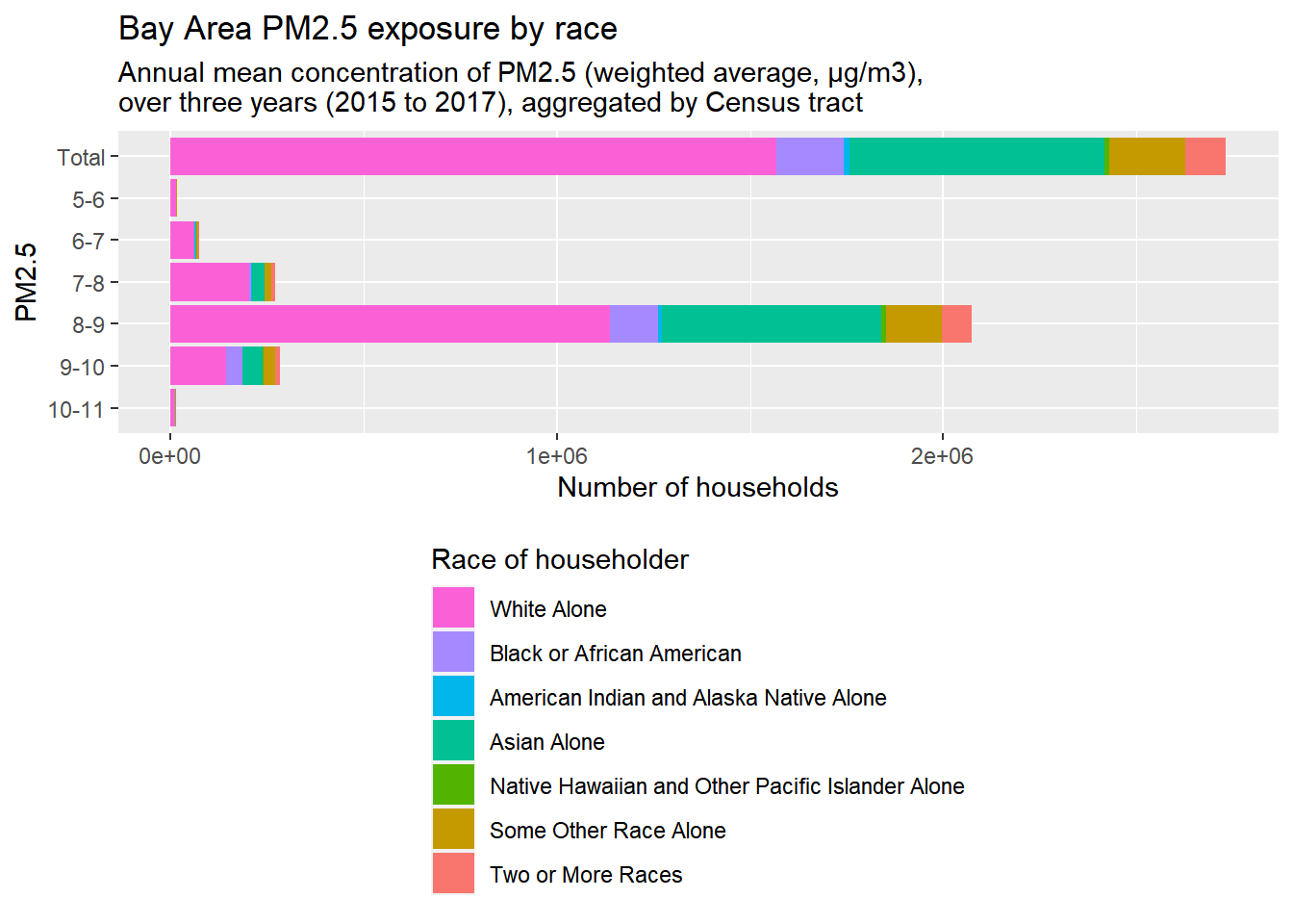
bay_pm25_race_fill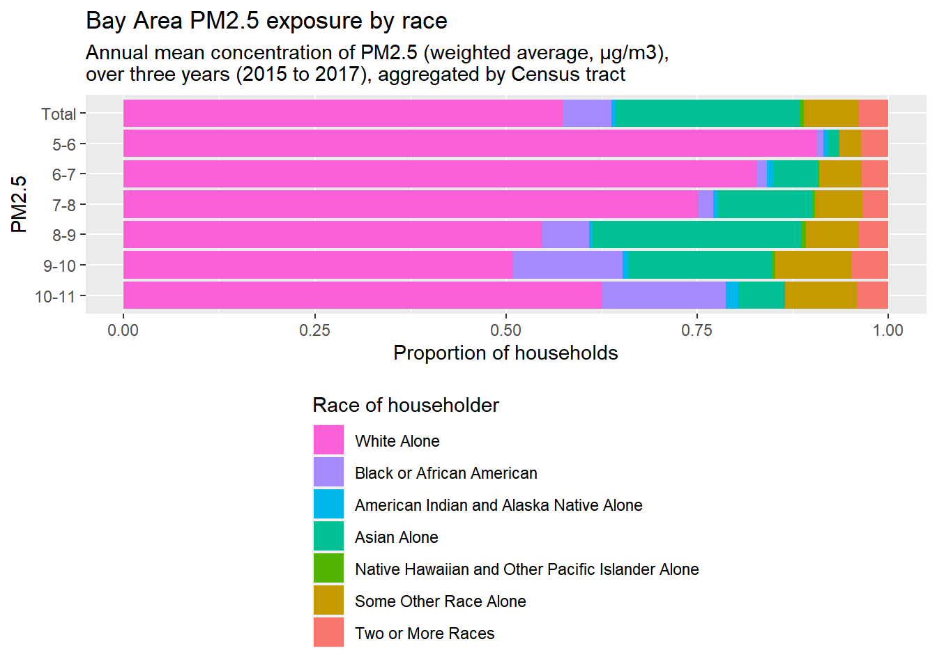
Notes:
- I gave the two plots variable names so I could plot them both more adjacent to each other in the final web page.
- I streamlined some steps from earlier, such as incorporating the
rbind()of the “Total” counts of the racial groups, into one pipeline. Keep in mind that that extra step is just there to add a “Total” bar to the top of the bar charts. - Because this measure is more technical, I’ve included a subtitle through
labs()to provide a more technical definition of the PM2.5 measure. Note how I use\nto create a line break in this text; sometimes you need to use\nto achieve this effect, sometimes you need to use<br>, which just depends on HTML details that you probably don’t need to worry about; just be prepared to try either.
The lowest two tiers turned out to have such low population counts that they should probably be merged into a “5-7” tier. Otherwise, based on these particular inputs and the assumptions of our methodology, there seems to be a disproportionate burden of poor air quality on Black households.